USER EXPERIENCE DESIGN
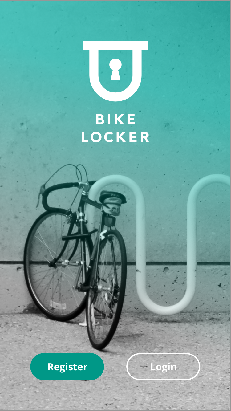
Bike Locker: Secure Bike Parking App
UX design for a crowd-sourced bike parking mobile app.
2019.04.22
The Bike Locker app helps cyclists find secure parking for their bicycle.
PROJECT DETAILS
CLIENT
Bike Locker
ROLE
UX designer
TEAM
UX/product designers and UI designers
RESPONSIBILITIES
Research, ideation, information architecture, design (wireframes and prototypes), user testing
Overview
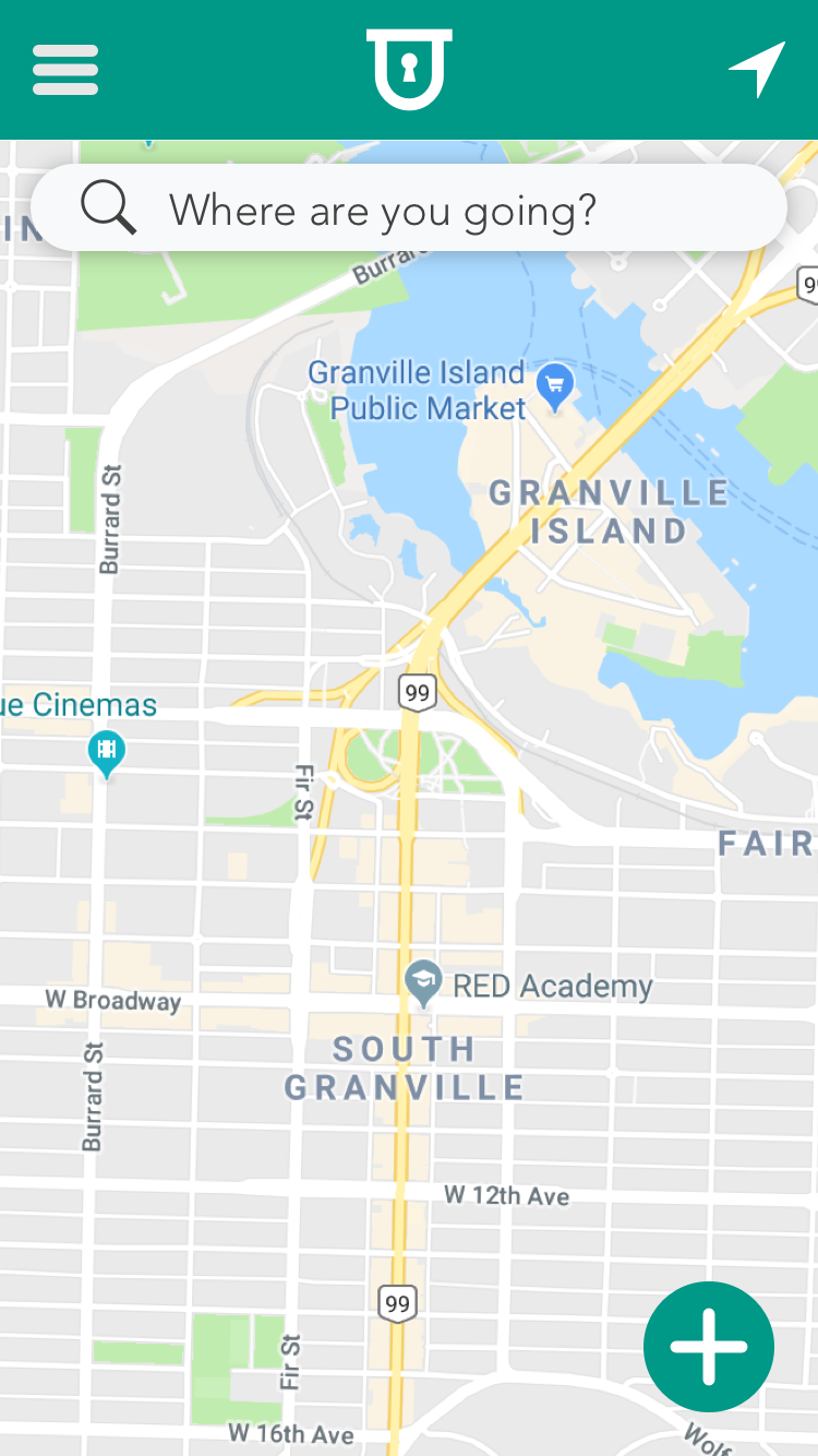
Bike Locker is an app that enables cyclists to find secure parking for their bicycle in Vancouver. With the app, users can locate a space, map their route, and rate and review the space.
Bike Locker is a small, Vancouver-based startup in the early stages of developing their business. They have conducted preliminary market research and created a basic brand-identity. At the time of writing, there is no website, social media, or digital platform.
Our team was tasked with designing and creating a high-fidelity prototype for the development of a minimum viable product (MVP) that could serve to drive the next phases of business development.
USER GOALS
- Find secure bike parking in Vancouver.
- Have peace of mind when leaving a bicycle for an extend period.
- Be part of a growing and supportive community of cyclists.
PROJECT GOALS
- Engage users to adopt the app and create a community.
- Collect user data.
- Design a scalable product starting with an minimum viable product.
BUSINESS GOALS
- Generate revenue by charging for bike parking spaces.
- Increase the number of cyclists.
- Capitalize on trends such as sustainability, less car use, environmental awareness, etc.
Challenges
- Provide value to users through a free, crowd-sourced mobile app.
- Clearly, and simply, display and quantify security levels.
- Create a scaleable minimum viable product (MVP) in a short (3 week) timeframe.
- Motivate users to contribute.
- Make it easy to use for cyclists on the move.
I. Discovery
Domain Research
Our UX team started by closely reviewing the project brief and validating any research data provided by the client. We tested their (and our own) assumptions both about the concept and its economic viability. None of us had ever seen or heard of a bike parking app before.
We looked locally and internationally at bike parking practices, initiatives and solutions. Fortunately, many Canadian cities publish outlines of their bike parking strategies. We found local,independent organizations tracking theft and discovered impressive facilities built internationally.
We looked at bike theft statistics and mapped out hotspots; found data published by the City of Vancouver indicating the location of all city-installed bike racks; and reviewed existing bike parking options (racks, corrals, lockers, parkades, etc.).
Further, we examined the close tie between bike parking and public transit, how growing bike share programs and pop-up bike valet services were performing, and even the success of grass roots lock-share initiatives set up by neighbourhood restaurants and coffee shops.
Competitive & comparaTIVE analysis
We needed to find out who (if any) were the existing players in the bike parking market and what were their offerings. We found many businesses and organizations attempting to address one or more aspects of the much larger bike parking picture. There were a variety of approaches, however, with little consistency or broader integration. We even found other bike parking apps, however, they were not local to Vancouver and showed very little engagement.
We also looked at comparable businesses that work in similar or related areas (e.g., bike share, car share, car parking, etc.). Many of these were already very popular mobile app services. These provided insights into features and functionality both for our MVP and later phases of the project.
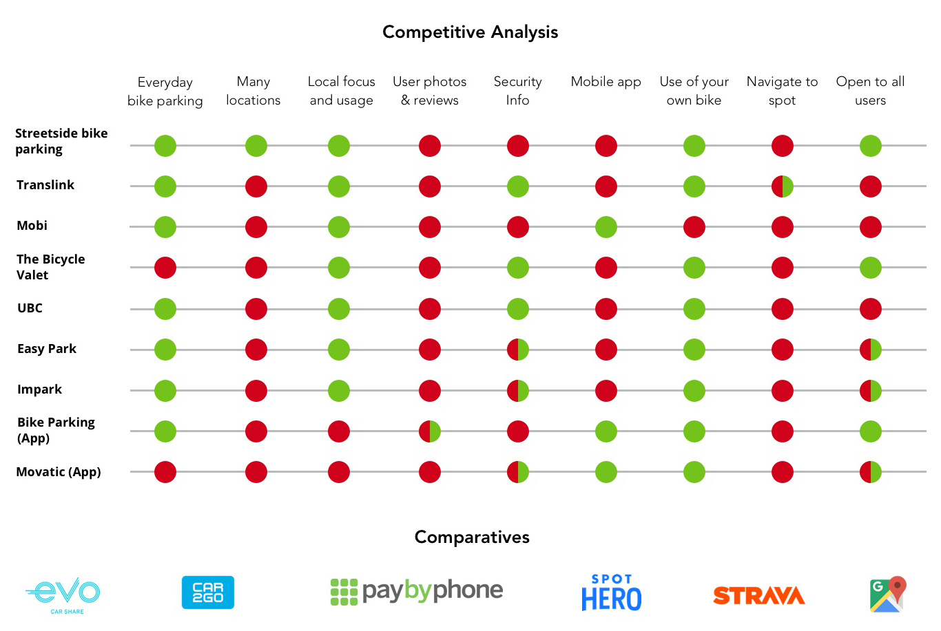
Competitive analysis: Local and US-based bike parking services. At bottom are popular mobile app services that, though not directly-related to bike parkging, provided insight into features and functionality.
SURVEYS & INTERVIEWS
As a team, we brainstormed questions for a survey and interviews. We were careful to ensure we included some direct questions about features users’ would like to see in a bike parking app and what would motivate them to contribute.
We conducted seven in person interviews with local cyclists, four phone interviews with local businesses (The Bicycle Valet, C-Media Outdoor, Translink and Impark), and another with the City of Vancouver. Calls to local business and organizations proved fruitful. We learned about the downside of the existing bike locker business model: reliance on physical keys proved slow and unreliable and advertising was the sole (tenuous) thing that made bike lockers a viable business. Further, upcoming changes to existing infrastructure were expected in the coming months and the result would not improve Vancouver’s bike parking offering.
Our survey returned 141 results in 24 hours. We deployed the survey through our team’s own social networks and Reddit’s Vancouver Cycling community.
Our survey told us that first- or second-hand experience with bike theft was very common. And people were more than willing to share their stories about bike theft through open-ended questions. Bike security as one might expect proved a primary concern for respondents and, in some cases, a reason why some choose to not ride their bikes. Another, less obvious, finding was that there existed an appetite to use technology to help improve the current cycling situation.
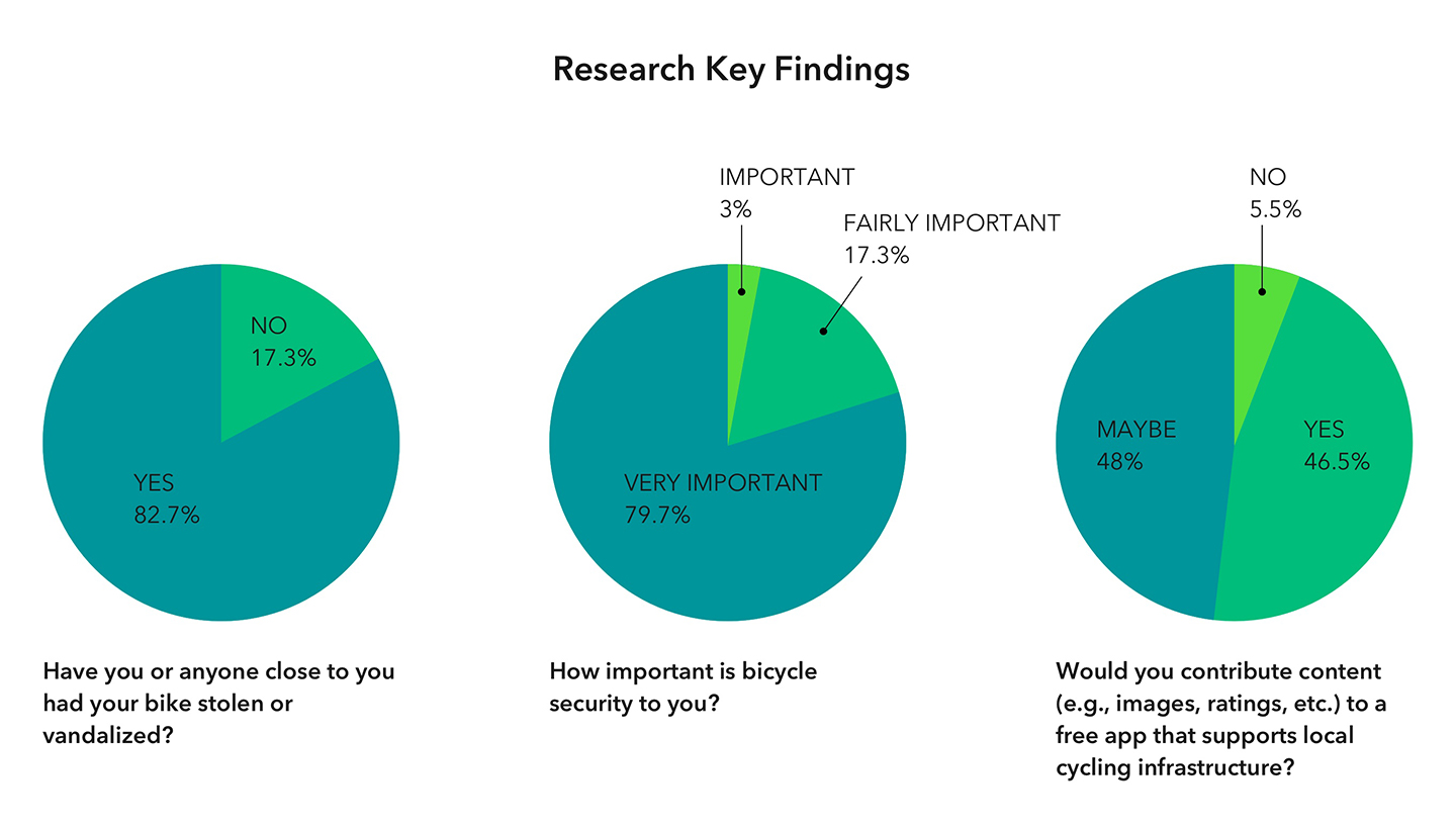
Some key findings from the surveys. We translated our raw data into information that could serve as the foundation for decisions moving forward.
Graphs and affinity diagrams helped our team further analyse our findings. We began compiling features cited by interviewees and survey respondents. We also began looking very closely at who our users were and what were their challenges. A great many people have and ride bikes, but who was this app targeting, especially in its initial crowd-sourced version? Since we would need as active a user base as possible we targeted those that rode most frequently: commuters, but also kept an eye on those interested in riding more often but hesitant to do so.
User Personas
The creation of personas would move us out of research and into the planning phase. Since active user participation is at the very core of any crowd-sourced app, we needed to look closely at what would motivate someone to contribute to our app. Our research data revealed two types of users: (1) 'the altruist' willing to contribute for the greater good of all and (2) 'the incentivist' capable of involvement, but only if rewarded. The emergence of this dichotomy allowed us to close out the research phase with a clear direction to take our user peronas.
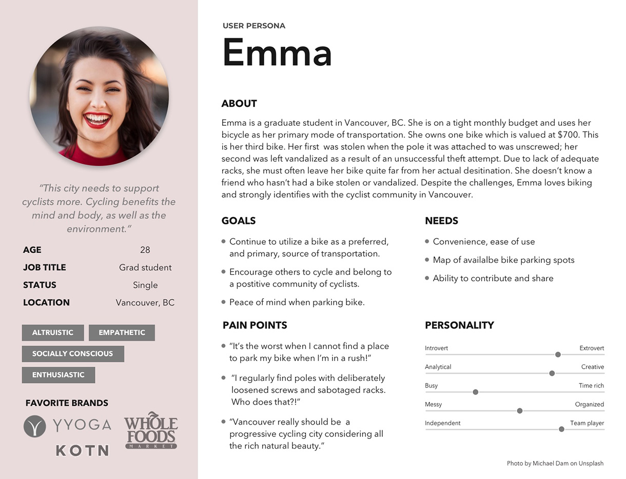
User persona 1: Emma is motivated to contribute to the app out of an interest in the greater good and community. She commutes to school daily and runs most errands by bike. She is willing to be an active contributor to a crowd-sourced app if it helps the greater cycling community.
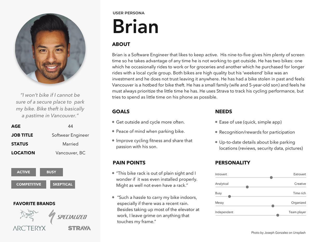
User persona 2: Brian requires some type of reward or incentive to participate. He has a very cynical view about Vancouver as a bike-friendly city, but, if he had more peace of mind, he would cycle more often.
II. Planning
storyboards
Our team created storyboards and scenarios to further flesh out our two user personas. Storyboards and scenarios are good tools to help expose user behaviour and related emotional implications as well as usage context (environment). Our personas acted as new group members, familiar overseers for the remainder of the project.
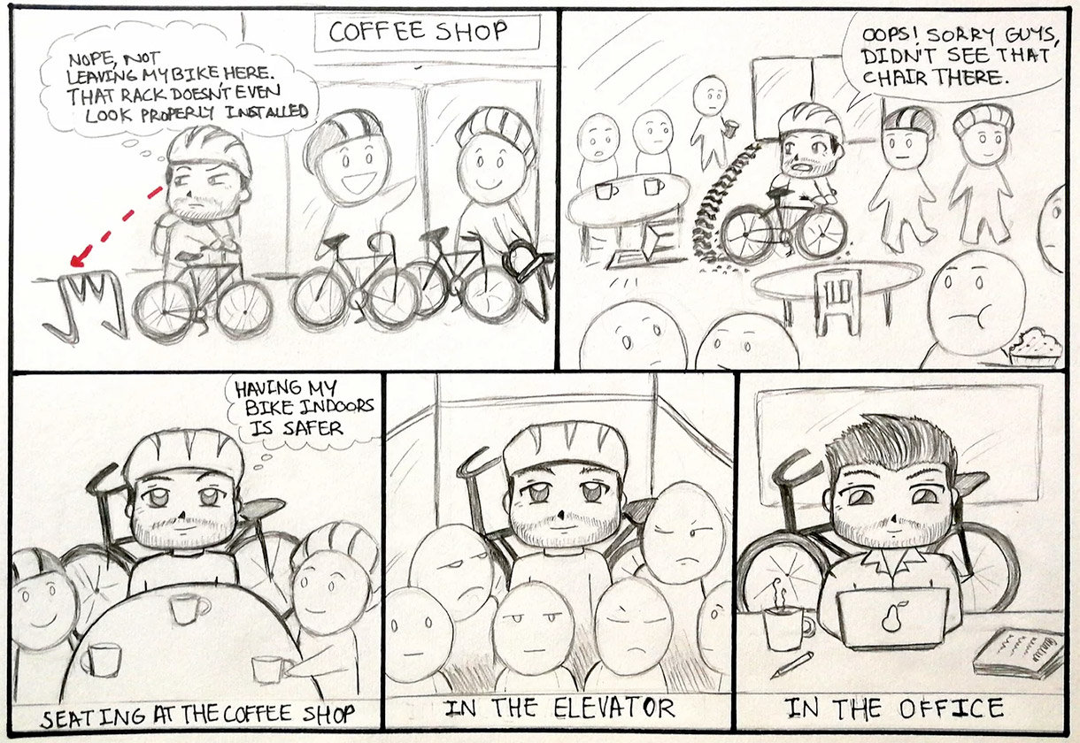
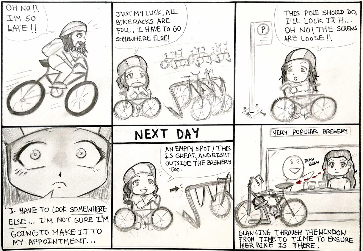
Storyboards put our user personas in context and help bring to light behaviorial, emotional and environmental considerations.
Affinity diagraming for feature prioritization
We next set out to tackle our app’s feature set. This was challenging since we had feature lists from multiple sources: the client (as specified in the brief), our survey/interview data — which, fortunately, aligned with some of our client’s requests, and our team’s own evolving list determined by our research- and production-based interpretation of the minimum viable product.
In order to organize, understand, and, ultimately, prioritize these features, we compiled all of our feature sources into an affinity diagram. We quantified the items that came from the survey data with percentages (e.g., reviews were requested by 73% of survey respondents) and ranked them accordingly. Then, to these, we added interview, competitor, and client-requested features.
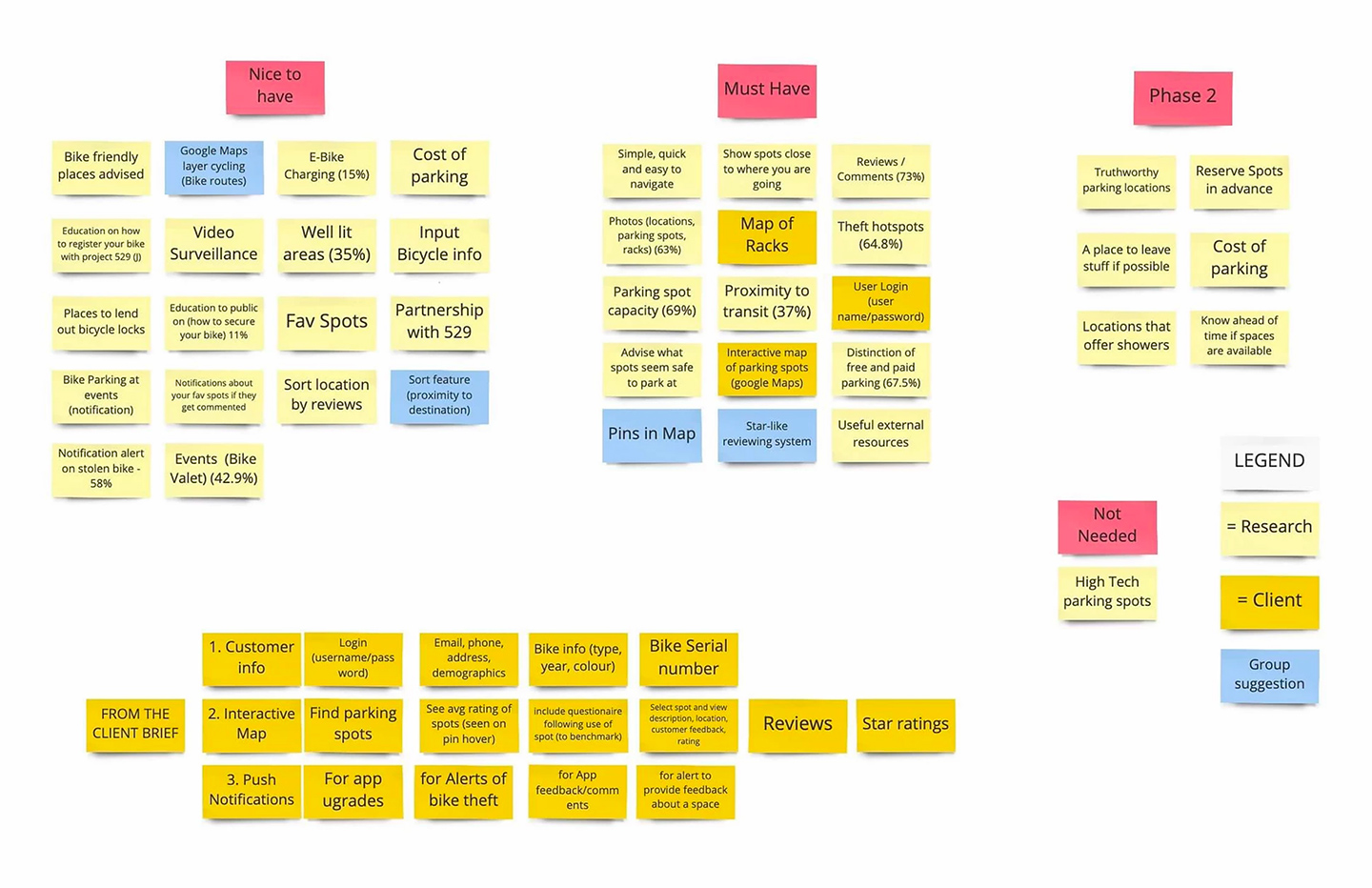
One phase of our team's affinity diagram mapping out and prioritizing features. Pink stickies represent categories used.
USER TASK FLOWS
The team used a user flow diagram to ensure we covered all user tasks (and sub-tasks) required for our MVP. These included: (1) search for the most convenient and secure bike parking location; (2) follow directions to arrive at a destination; (3) provide information on an existing location; (4) add a new bike parking spot to the map; and (5) create a user profile.
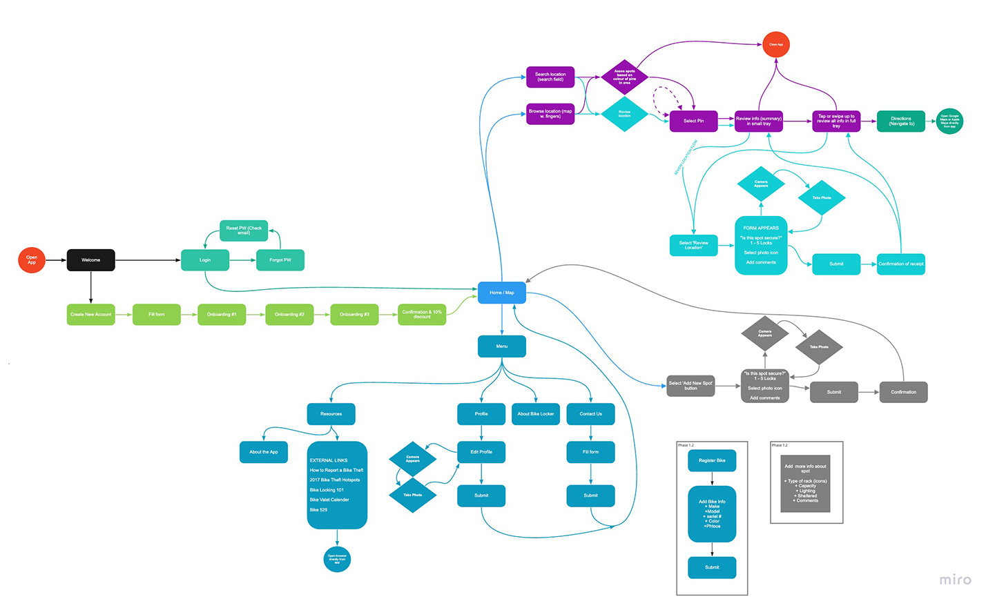
User flow diagram mapping all user tasks, interactivity and functionality as well as ensuring efficient (smooth/quick) access to desired content.
Sitemap
We also created a sitemap to quickly communicate the essential architecture of our application. Through organizing site content we could make key decisions about categorization, heirarchy, labeling and, ultimately, navigation. All these decisions would be relevant to potential future stages of app development. The structure took into account a future that could include reserving bike parking locations and support for financial transactions.
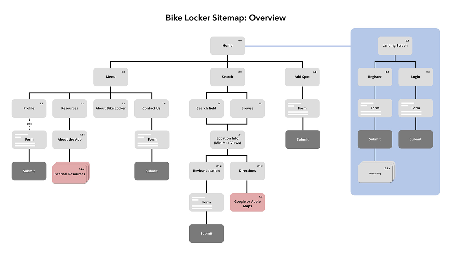
Sitemap establishing site structure, catgorization and hierarchy of content and navigation.
III. Design & Testing
SKETCHING & PAPER PROTOTYPES
Before jumping into sketching out prototypes, the UX team took the opportunity to reframe and quickly test our assumptions, we wrote a series of user (and job) stories: e.g., As an everyday cyclist, I want to find an easy way to contribute to Vancouver’s cycling community, so that Vancouver’s cycling infrastructure improves for everyone. (User story 1: persona 1, Emma).
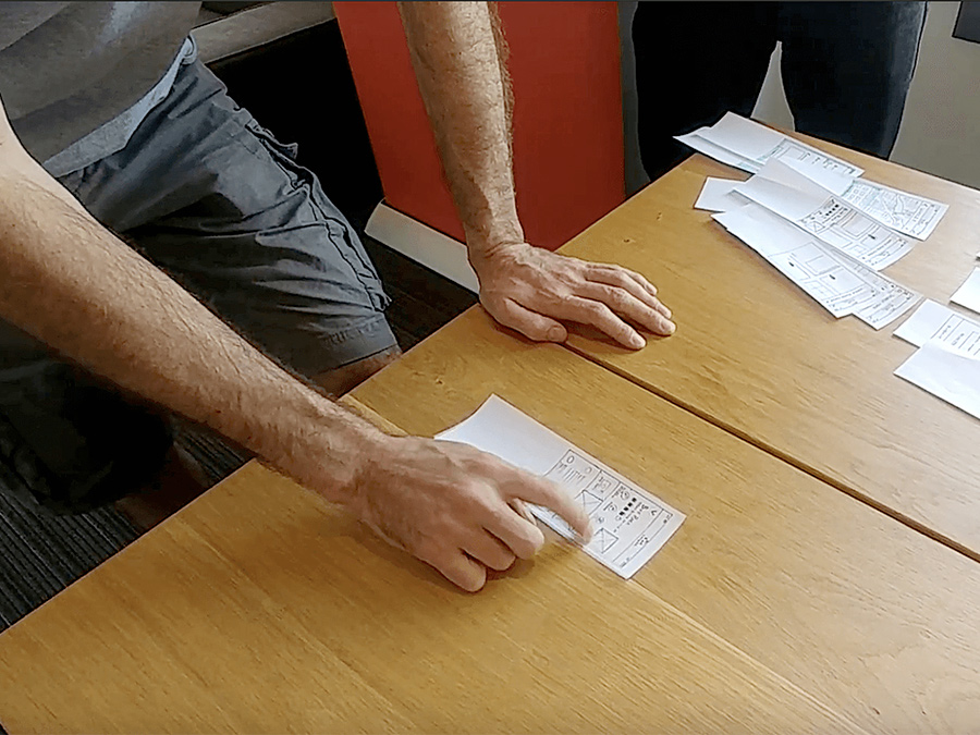
Initial thumbnail sketches were crude and played with layout. We focused on a few key screens to build our initial paper wireframes around. These would support basic task flows for testing: (1) find a bike parking location; (2) edit (which later became ‘review’) an existing bike parking location; and (3) add a new bike parking location to the map.
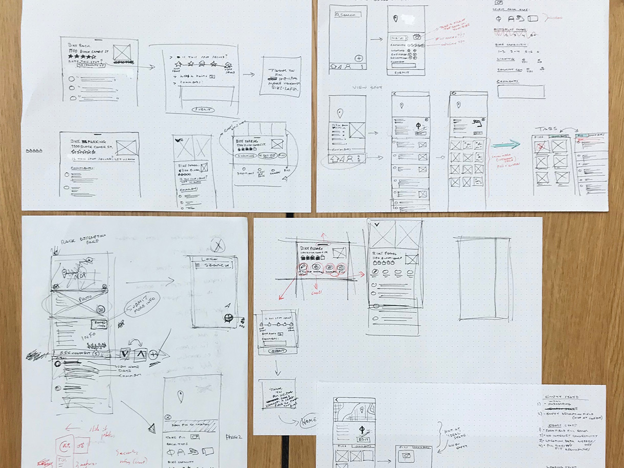
Selection of the team's quick initial sketches exploring layout and determining key screens.
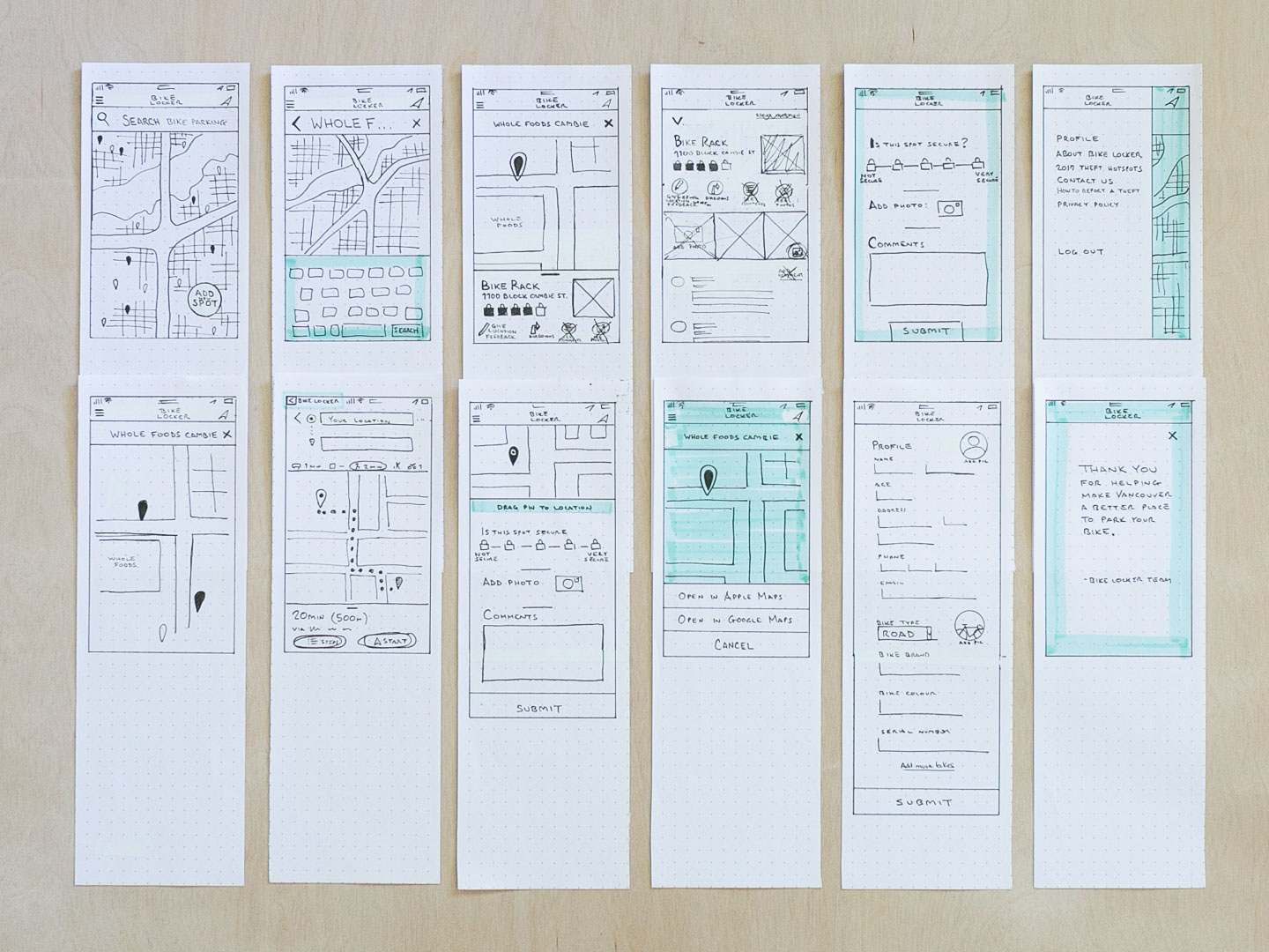
First screens of paper prototype, ready to test with users.
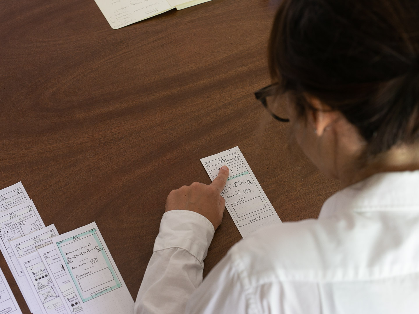
MEDIUM-FIDELITY PROTOTYPE
After initial user tests with the paper prototype and some quick iterations , we moved the design to digital. The team created a medium-fidelity prototype which could serve as the foundation for the final design and serve us for the next round of user tests.
Sample screens from the initial medium-fidelity prototype which facilitated further rounds of user testing.
USER TESTING
User testing, even at such a rudimentary stage, was very valuable. We made sure to employ the 'think-aloud protocol' in order to capture what was going through users minds as they carried out prescribed tasks.
With our paper prototypes we were able to make quick modifications and iterate on screens to support A/B testing. The kinks ironed out at this stage would save us time when we moved our design to digital.
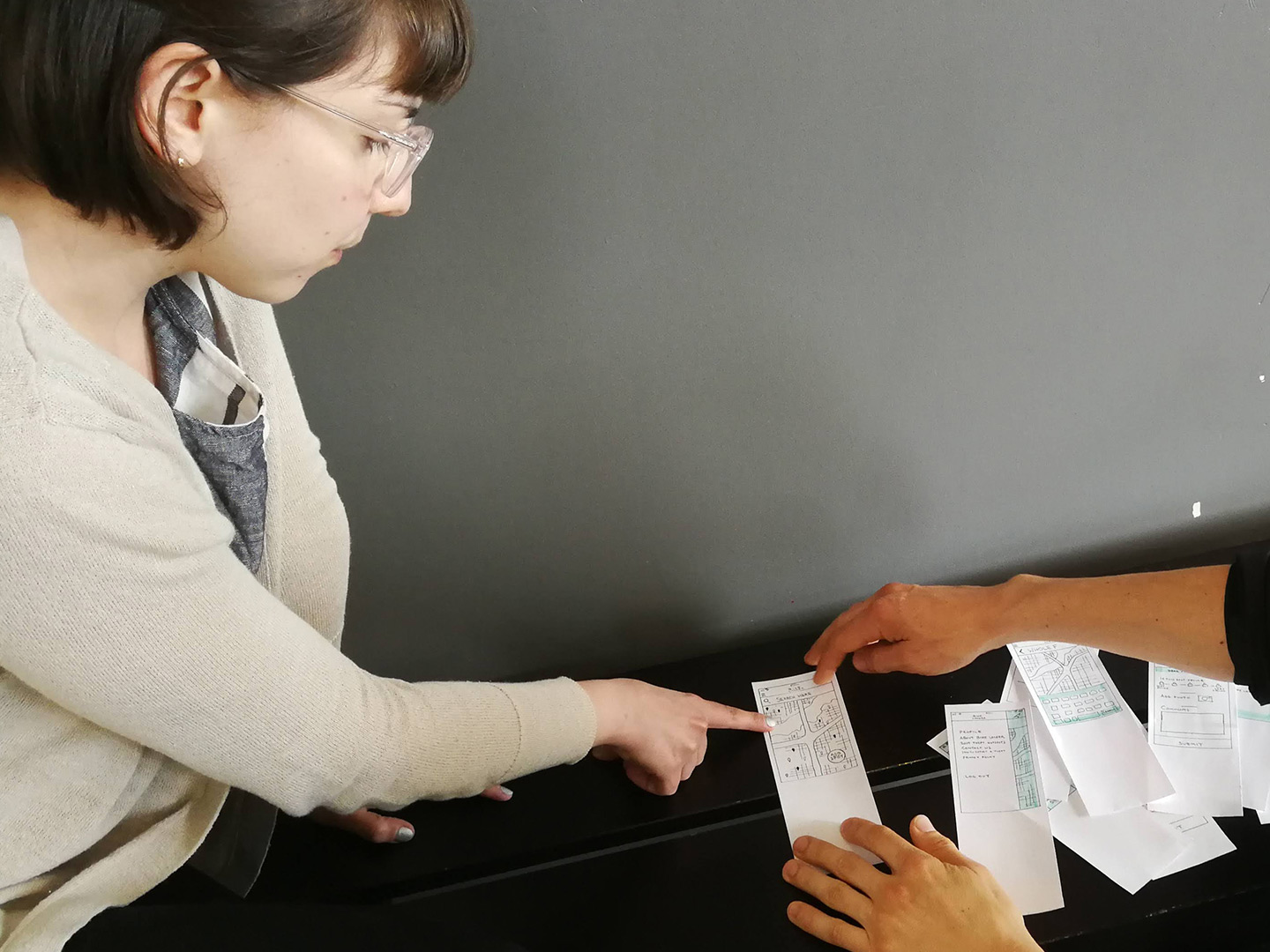
User testing low- (paper) and medium-fidelity prototypes quickly made apparent any confusion, ambiguity, or other pain points.
KEY FINDINGS
- The initial multi-field form was too much to expect users to fill out for each parking space.
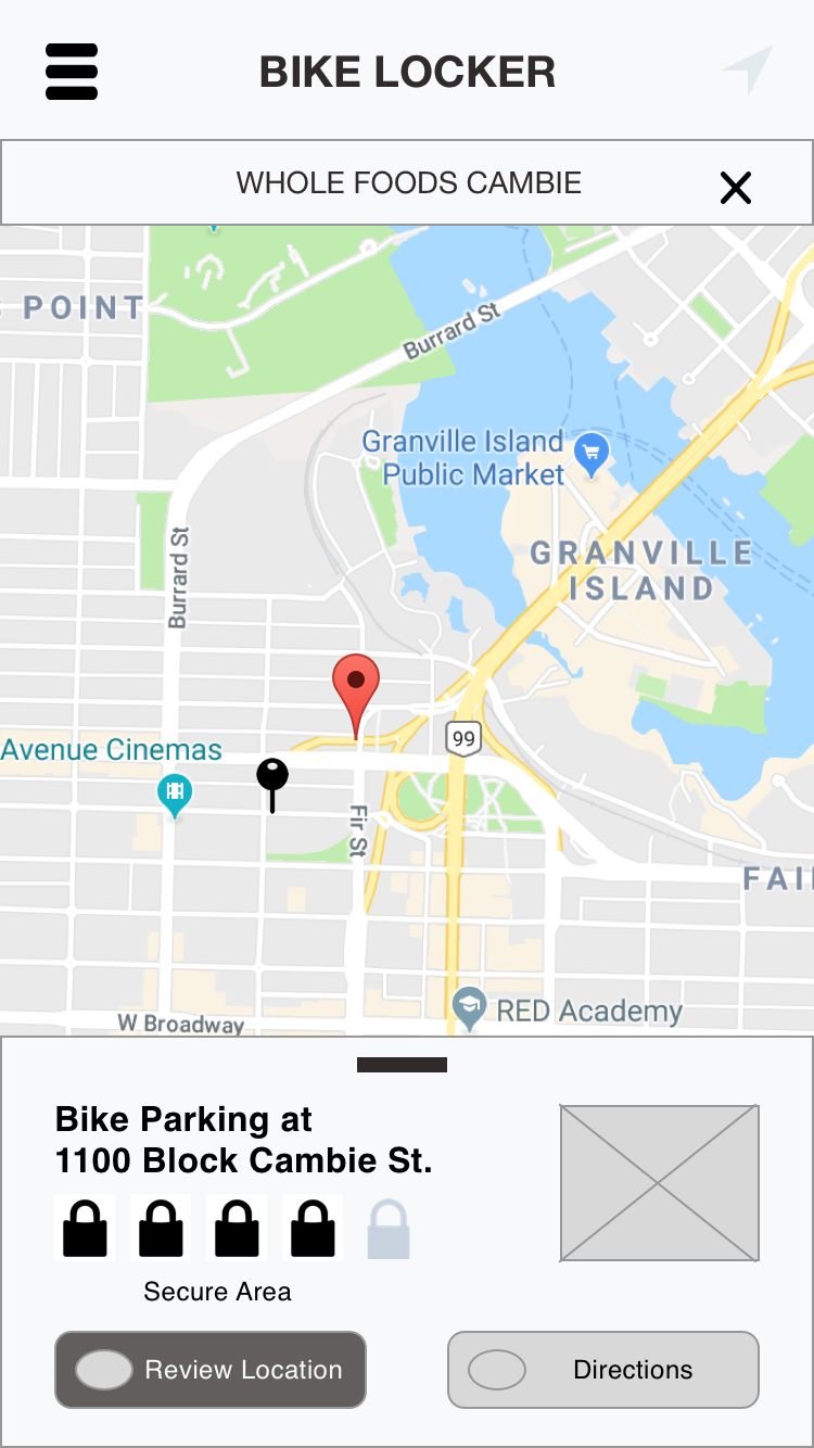
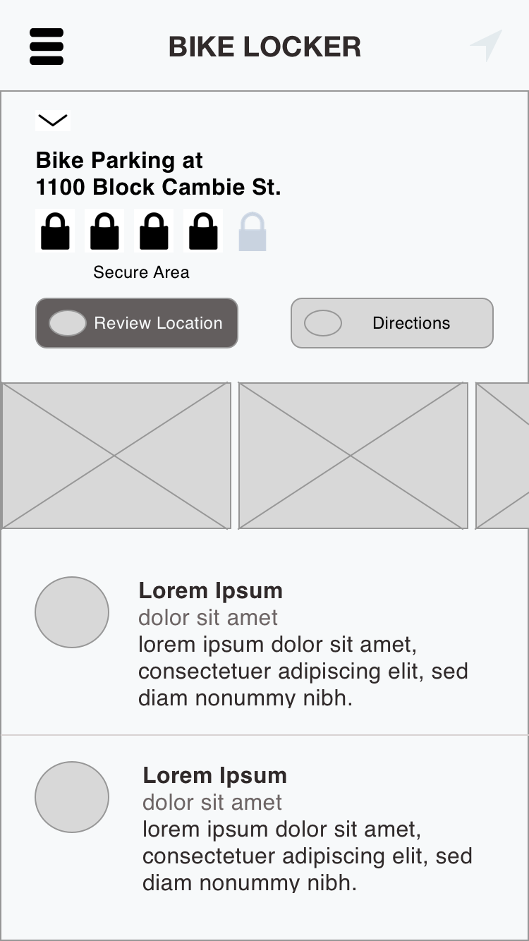
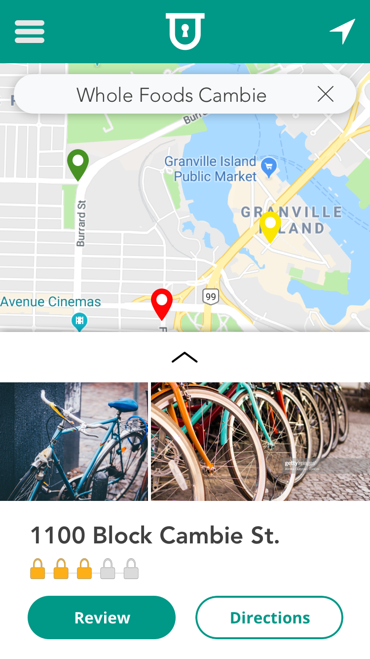
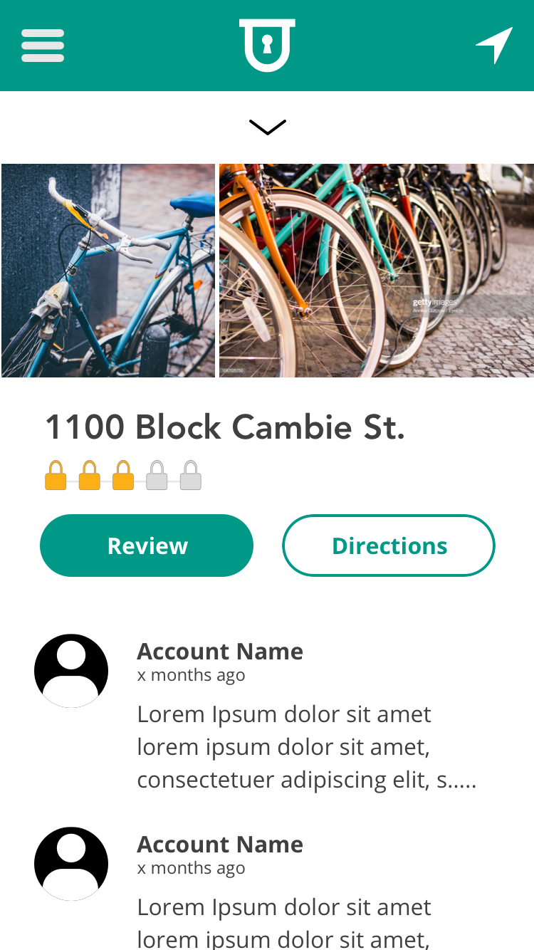
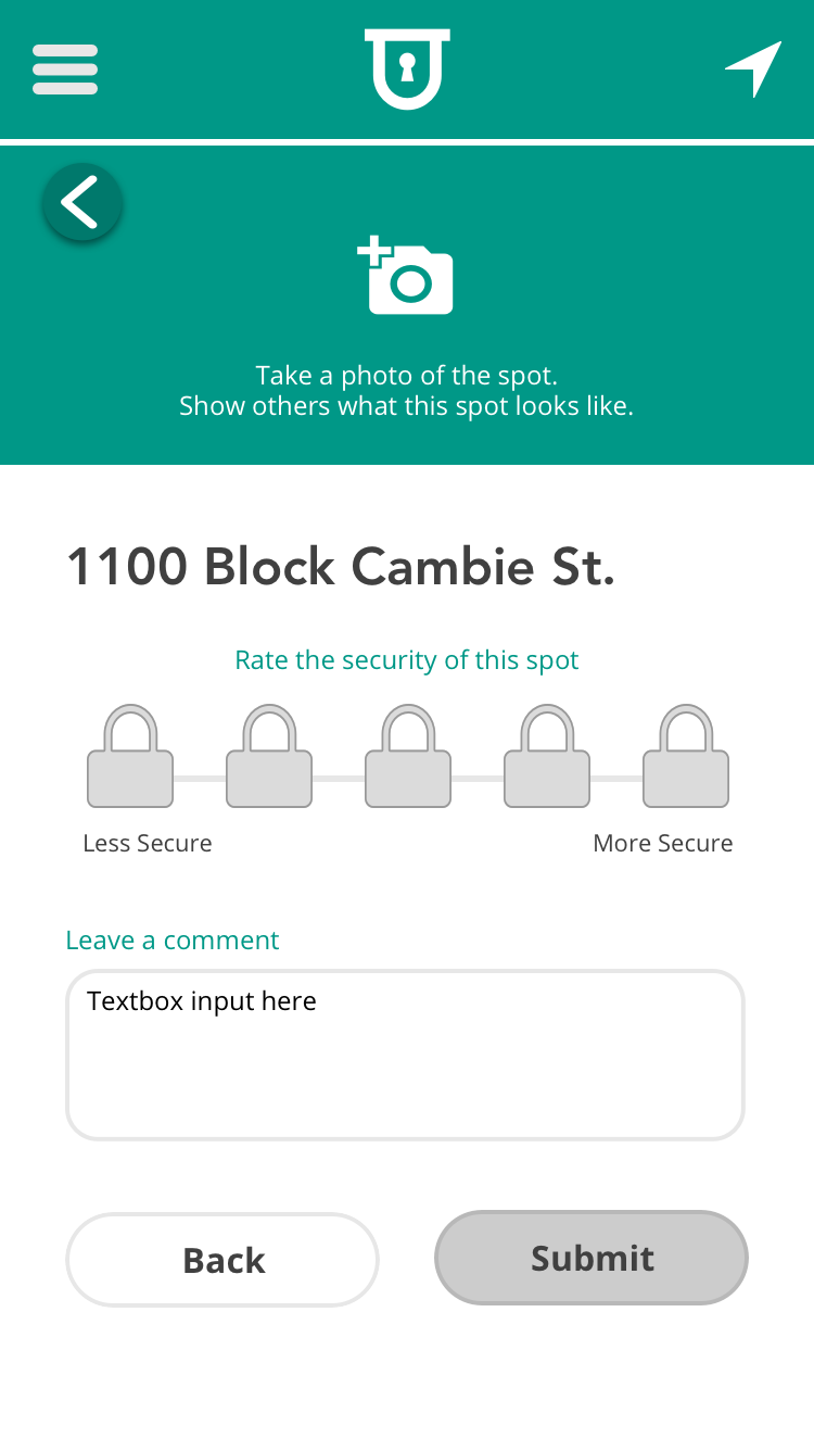
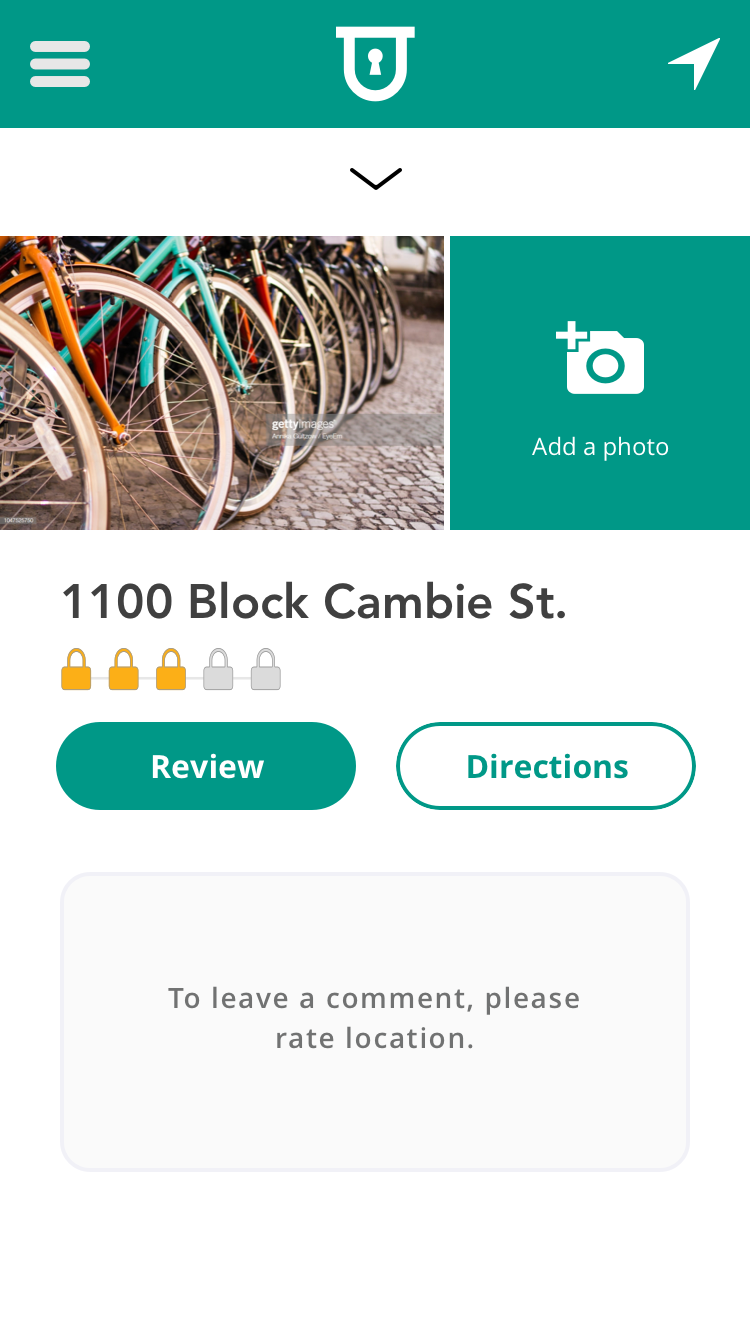
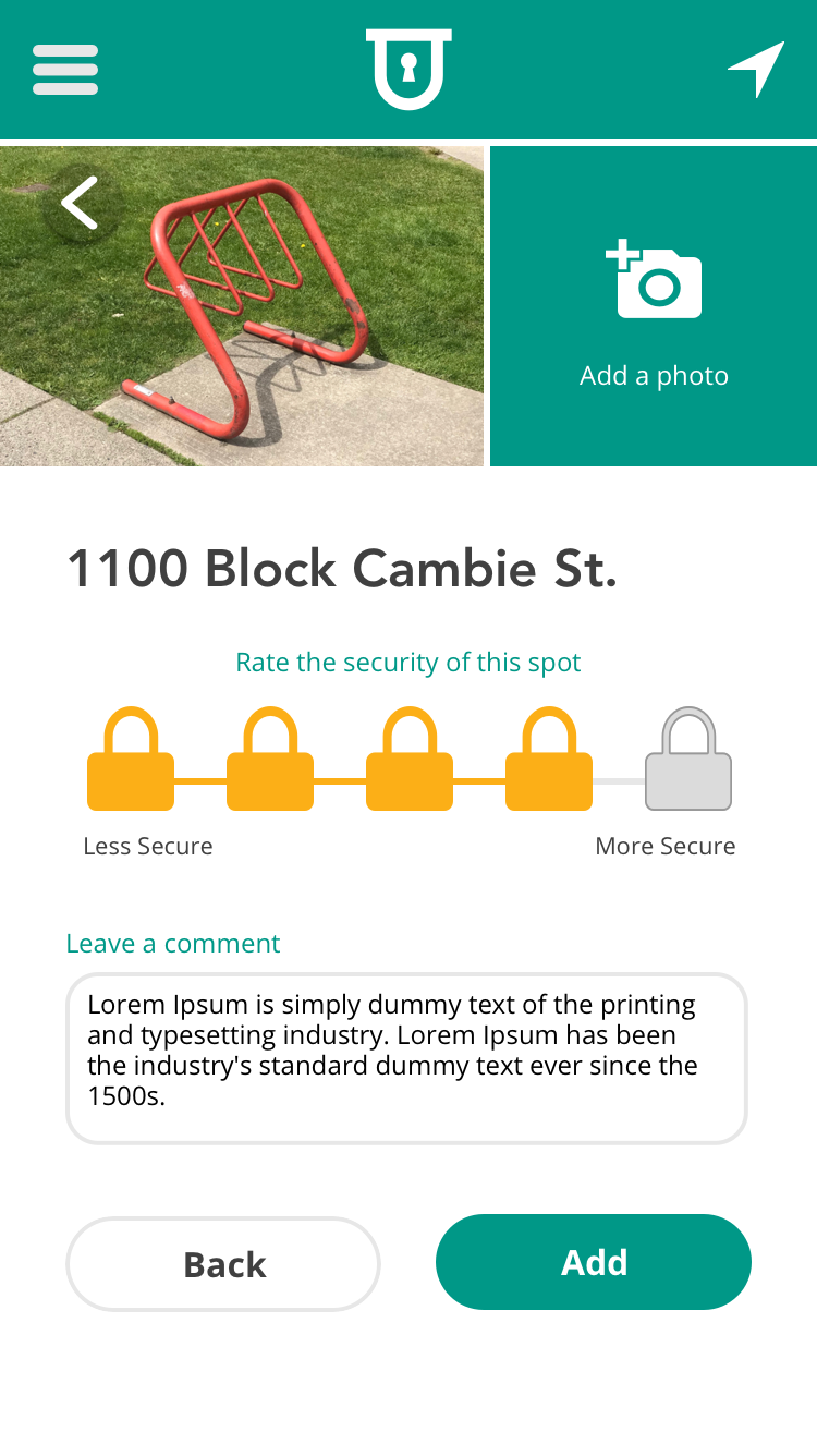
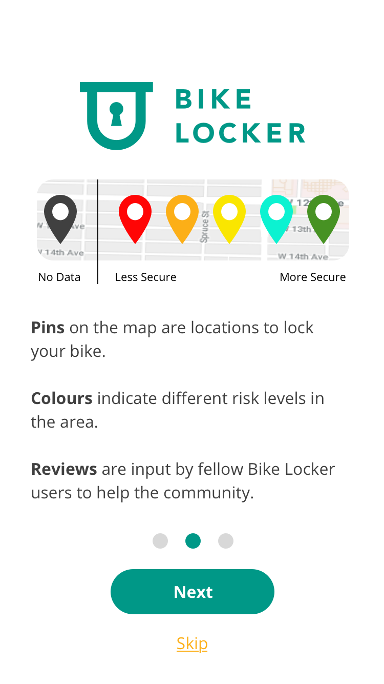
Solution —Replace the review spot input fields with a mandatory sliding scale (security) and two optional fields only: photos and comments. - Neither star icons (client request) nor brand logos (UI team suggestion) clearly indicated security level to users.
Solution —Utilize five lock icons and a colour fill to depict the security level: not secure (extreme left) to very secure (extreme right). - Confusing labels: 'Leave location feedback,' 'Review location,' and 'Comments' were all guilty of causing hesitation with users.
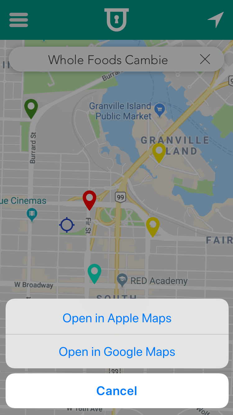
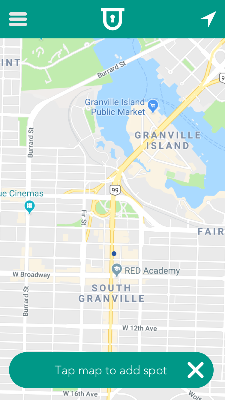
Solution —Shorten labels to 'edit', 'review', 'rate' and 'comment' and A/B test with users for feedback. - Placement of the ‘Add spot’ button. This was A/B tested. (A) On map, bottom right as floating action button (FAB), and (B) in header bar, top right of logo.
Solution —Though user’s found the button in either location, placement on map, bottom right meant users could access it quicker and easier during single-handed use.
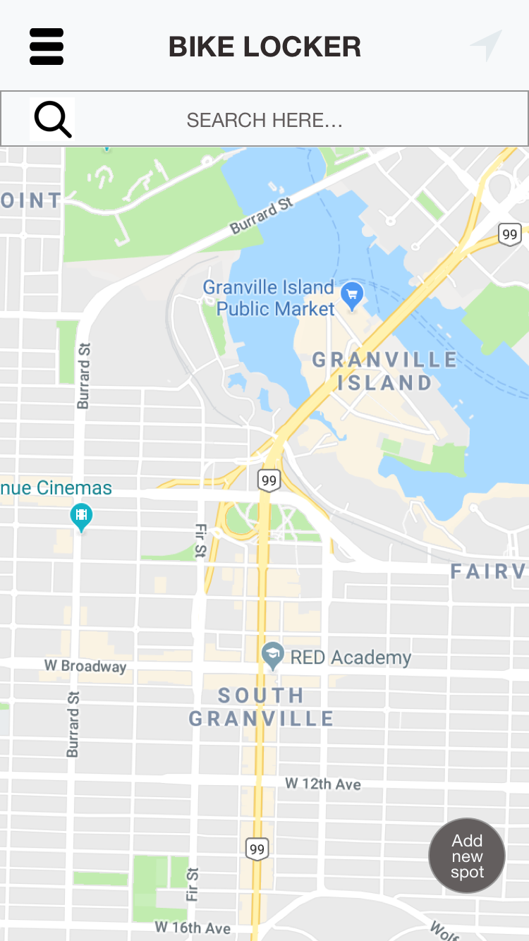
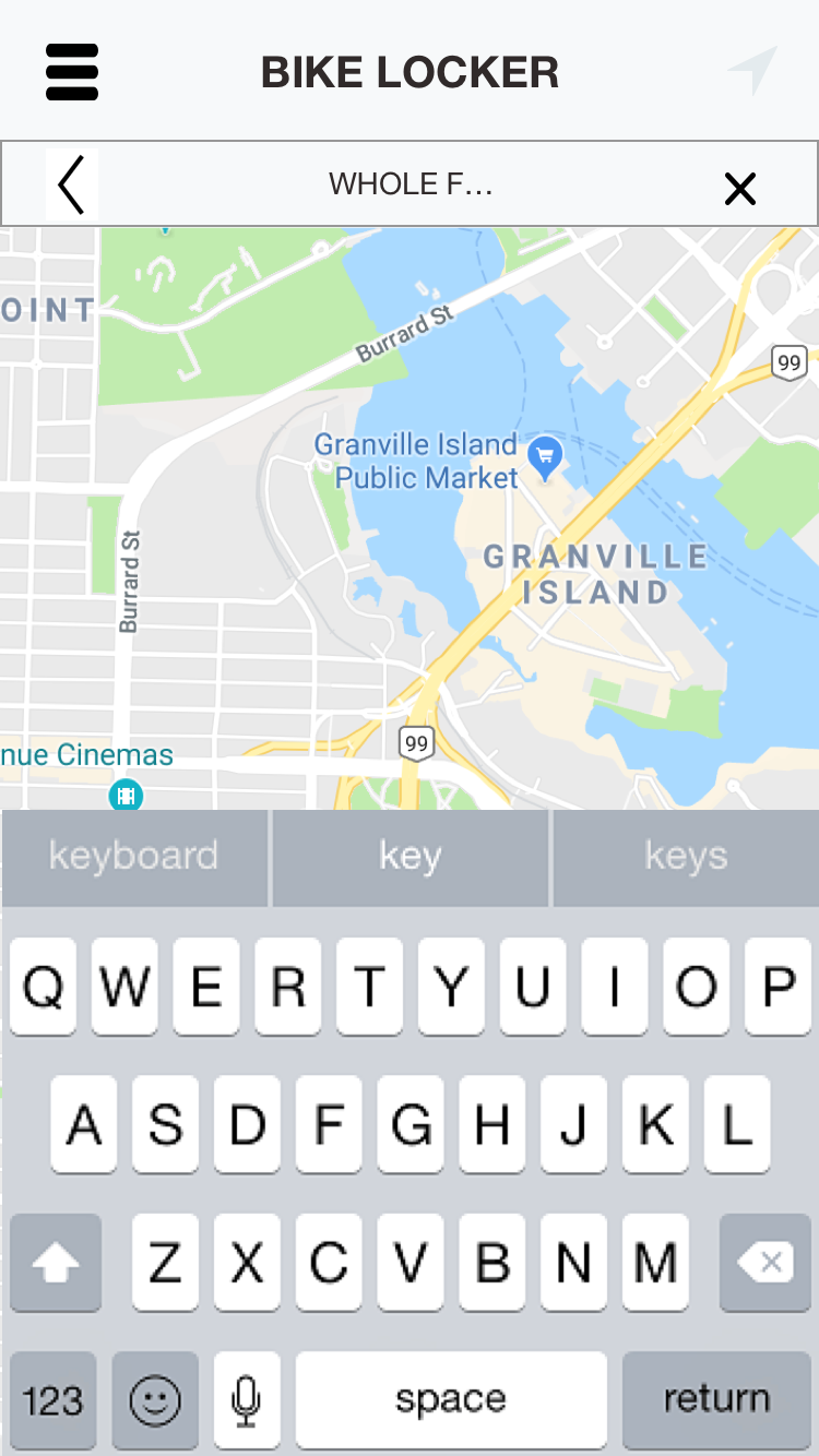
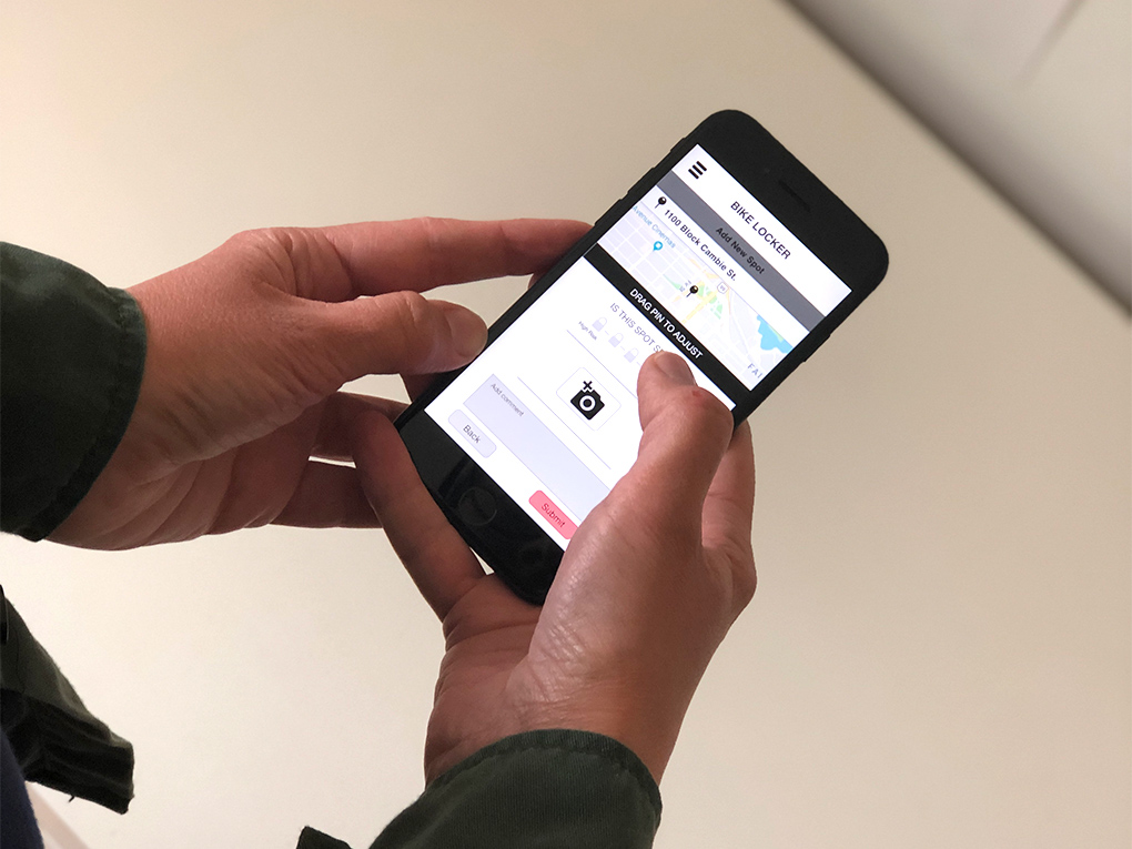
HIGH-FIDELITY PROTOTYPE
The user interface took our design mocks and applied brand styling, colour and images. These mocks were combined into a comprehensive high-fidelity prototype on Invision for client feedback. Minor tweaks made the prototype was delivered to the app dev team.
Conclusion
The Bike Locker app seeks to help users find secure bike parking and in order to do this it employs a clean, minimal appearance. Simplicity is crucial to encourage regular use and wide-spread adoption.
With successful adoption (and through quality partnerships), Bike Locker has the potential to engage a devoted community of users that, through regular use, will create and manage an essential cycling resource, one that may result in more bikes on the road, peace of mind for cyclists, a stronger cycling community and a tangible improvement to Vancouver's bike parking infrastructure.
Copyright © 2020 Oliver Tomas. All rights reserved.