USER EXPERIENCE DESIGN
Elemental Labs: LMNT Value Bundle: V
UX design for the product page of a new, customizable LMNT product value bundle.
2020.03.16
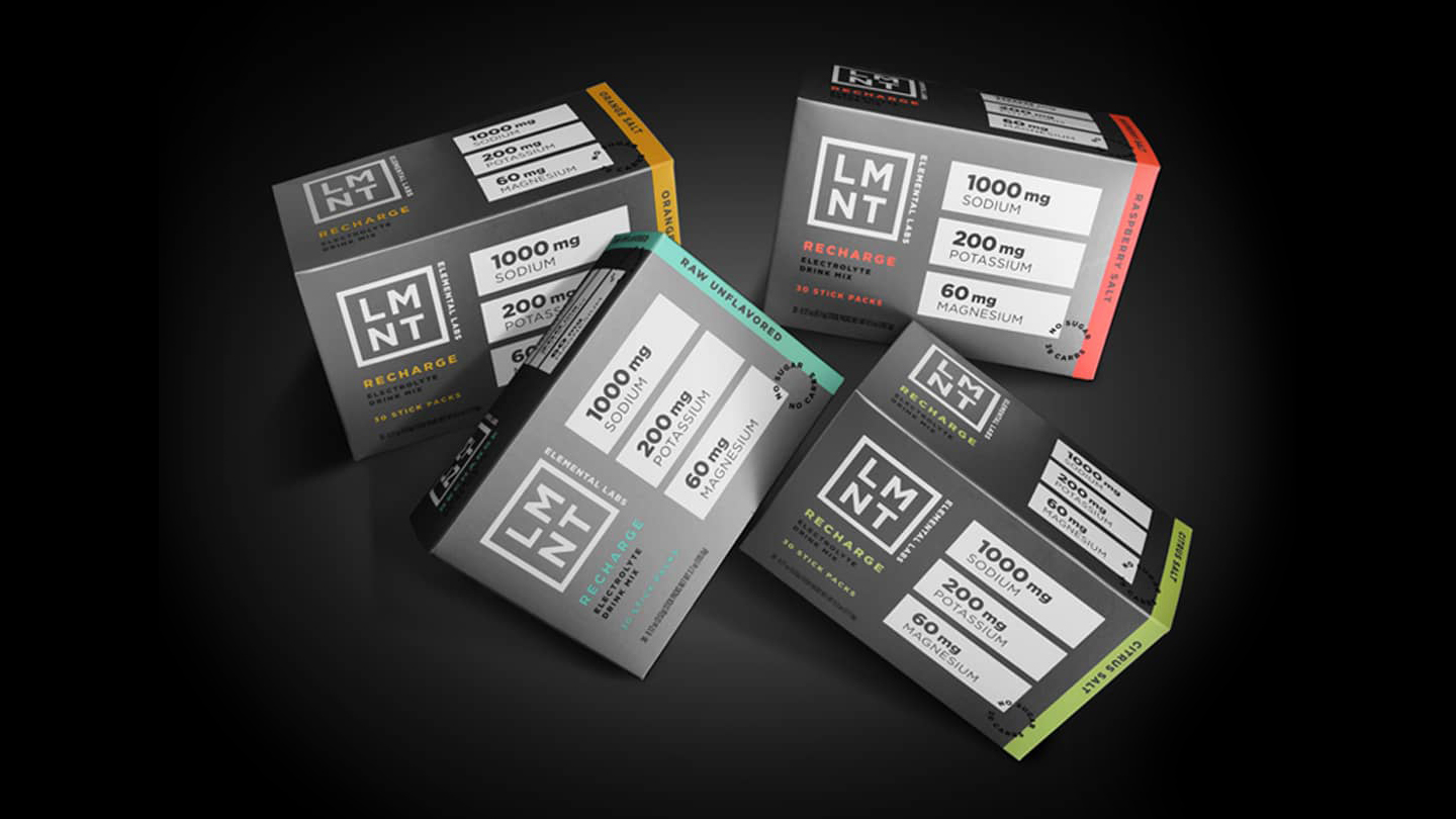
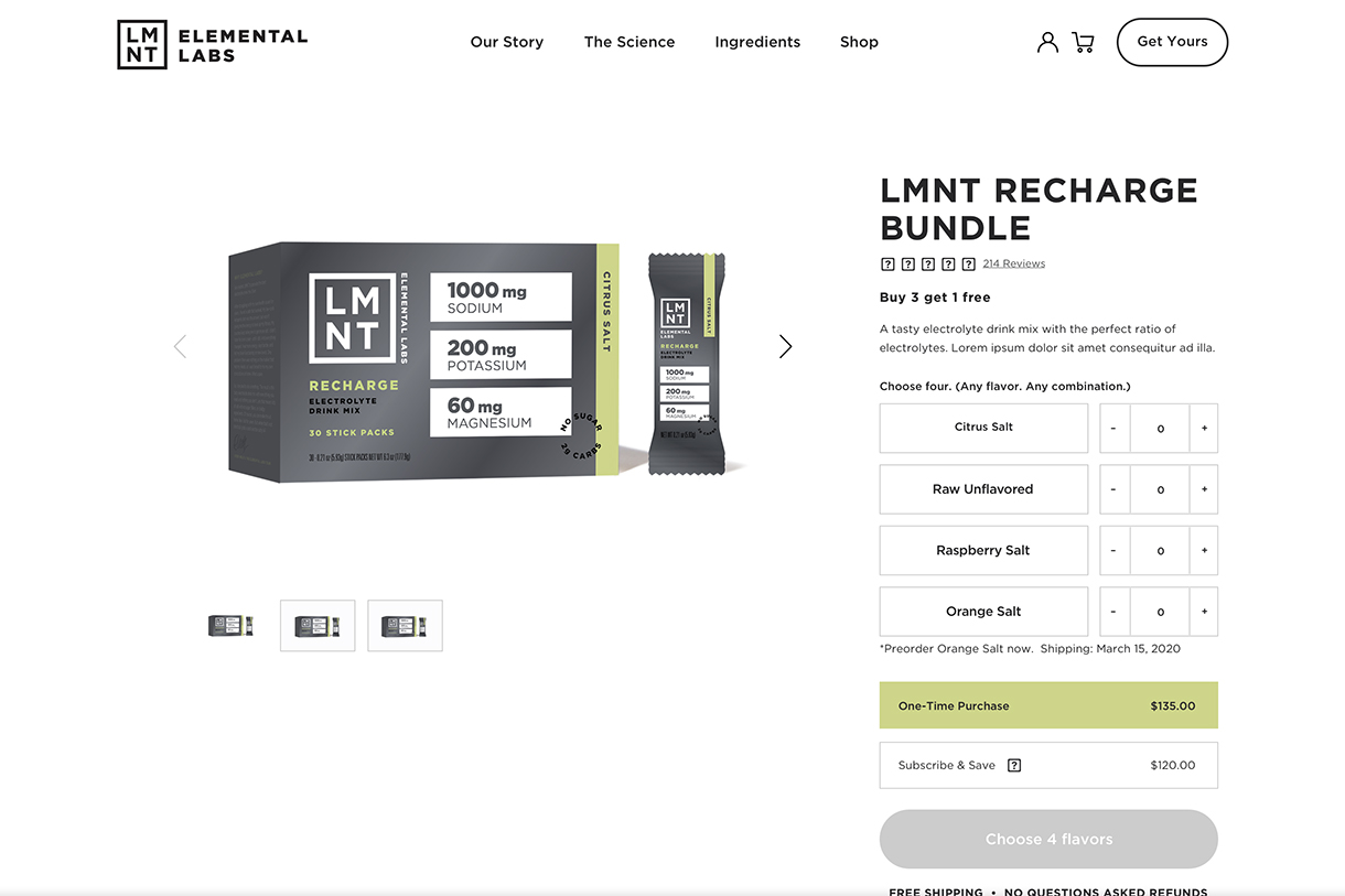
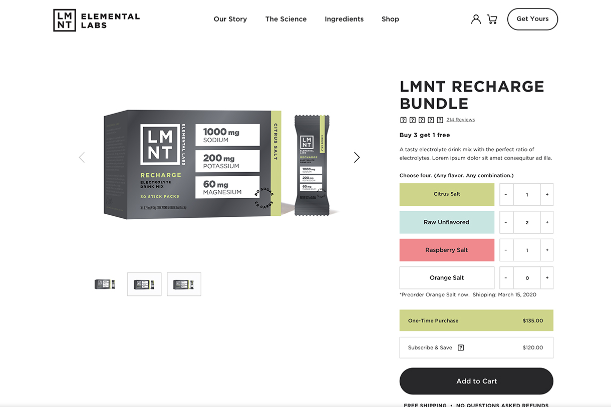
LMNT Value Bundle: buy any three LMNT 30 count boxes and receive one free. (Photo: Elemental Labs)
PROJECT DETAILS
CLIENT
Elemental Labs (via The Jibe)
ROLE
UX designer
TEAM
Oliver Tomas, The Jibe
RESPONSIBILITIES
Research, ideation and design (wireframes and prototypes)
Overview
I was hired by The Jibe to assist in the UX and UI design of a new value bundle product page for Elemental Labs. I was responsible for ideation, design and the creation of wireframes.
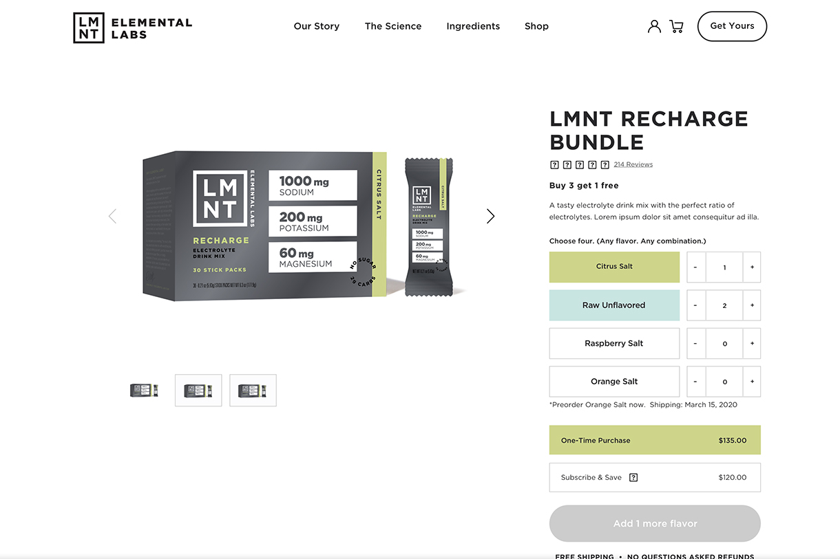
LMNT is an electrolyte drink mix available in a growing number of flavours. The product comes in a single flavour 30-count box or variety pack. The launch of a new value bundle (buy any three 30-count boxes and receive one free) necessitated the design of a new product page where users could customize their own value bundle from assorted flavours.
Project Goals
- Make it easy for users to create and purchase customized value bundles.
- Utilize existing page structure and brand styles to create a consistent visual experience.
- Create a scalable design capable of accomodating the addition of more flavour options in the near future.
Research
The typical ecommerce product display page (PDP) has a well-established layout and utilizes design patterns (calls to action, quantity and variant selectors, image galleries, etc.) that have been thoroughly tested over the years. This familiar convention works very well for most products.
A less common and more complex design pattern, however, is required for product pages facilitating the purchase of a user-selected (custom) product assortment. This can take the form of multiple products grouped together in a 'bundle' or a single item with customizable elements.
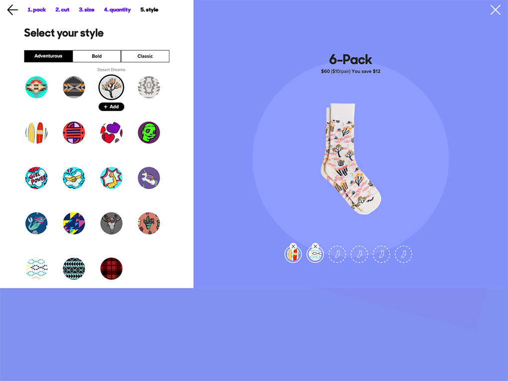
The multi-product 'bundle' exists in a wide range of industries: clothing, gift, health and wellbeing products, to name just a few, and takes the form of a 'gift box', 'value pack', 'product bundle', etc. Similar is the customizable single-product which is especially common in today's food ordering apps (custom toppings) but can also be found elsewhere ('make your own' bouquet, etc.).
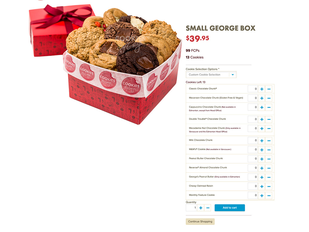
Cookies by George 'Small Gift Box'
MeUndies 'Customize your perfect pack'
Native 'Build your pack'
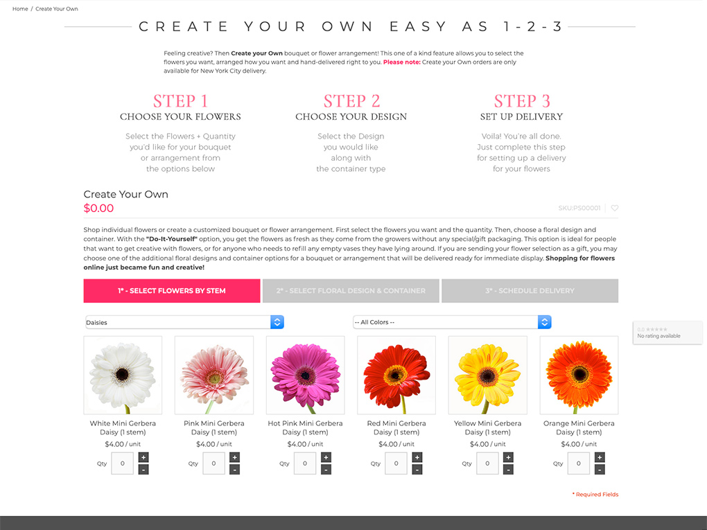
Plantshed 'Create your own bouquet'
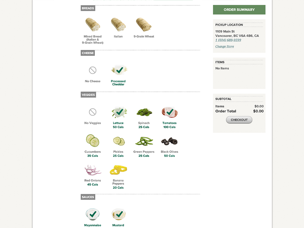
Subway 'Customize your sub'
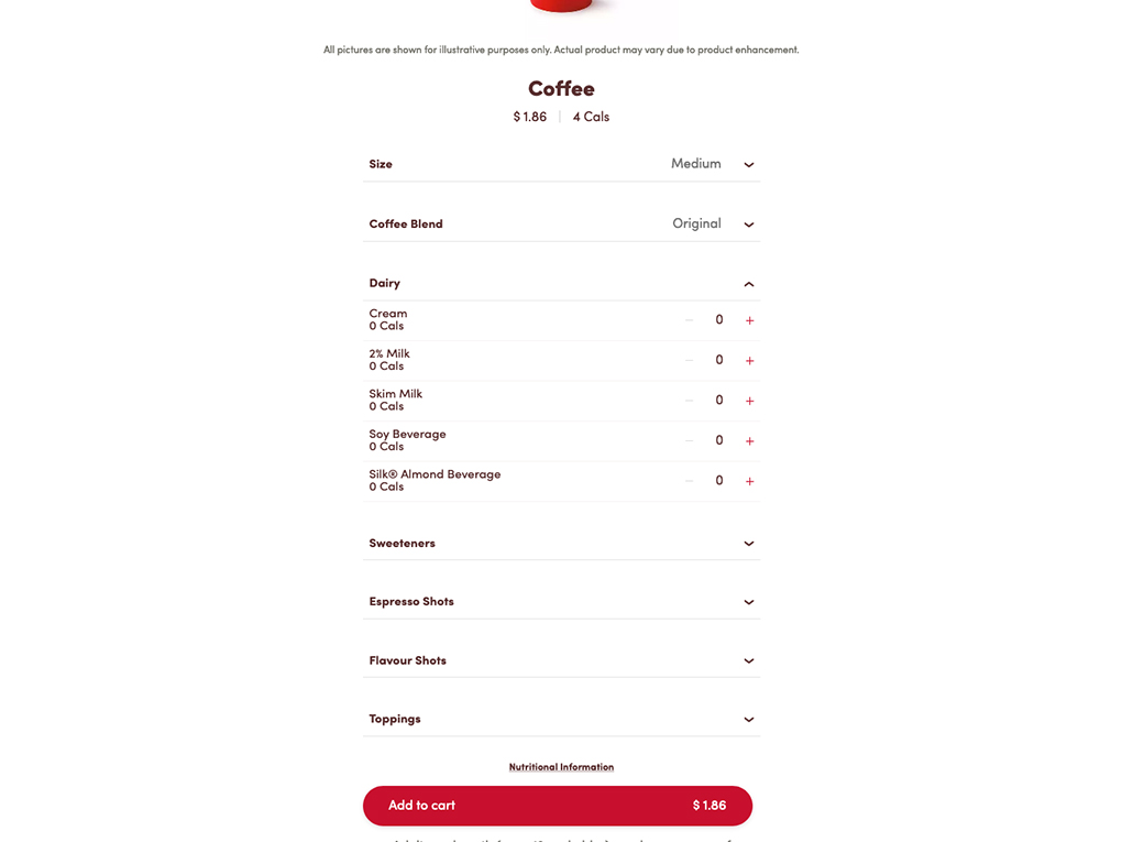
Tim Hortons coffee options
Some examples of multi-product 'bundle' and single item customization design patterns from different industries.
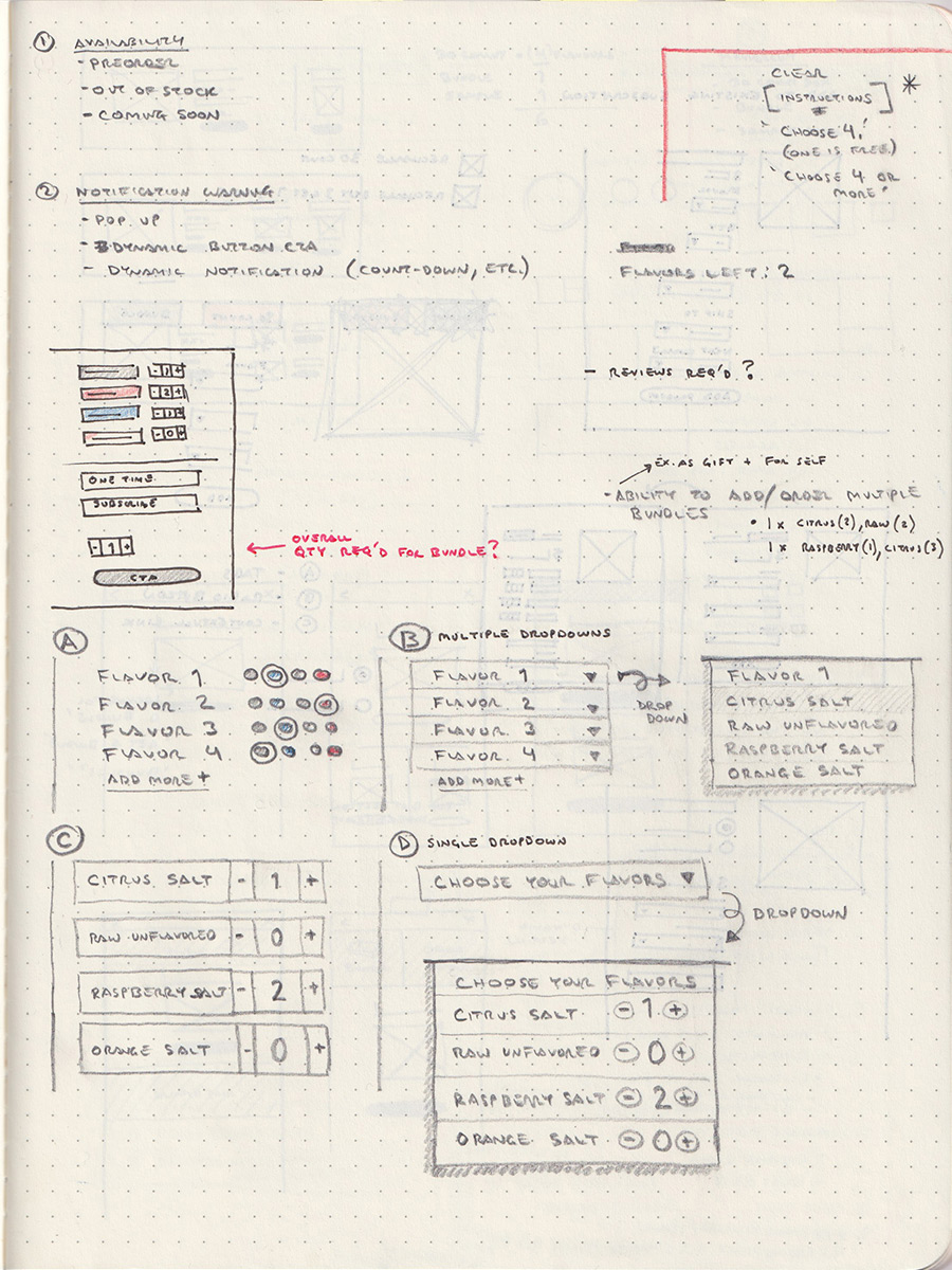
Ideation & Sketching
Primary UX considerations revolved around usability and interaction. These included clear affordance for actions: add/select, edit, remove, checkout/add to cart and feedback along the way (progress or stage of bundle creation) and mobile optimization. Additional considerations took into account existing UI and brand styles, design and development resources, and scalability (ability to add more flavours).
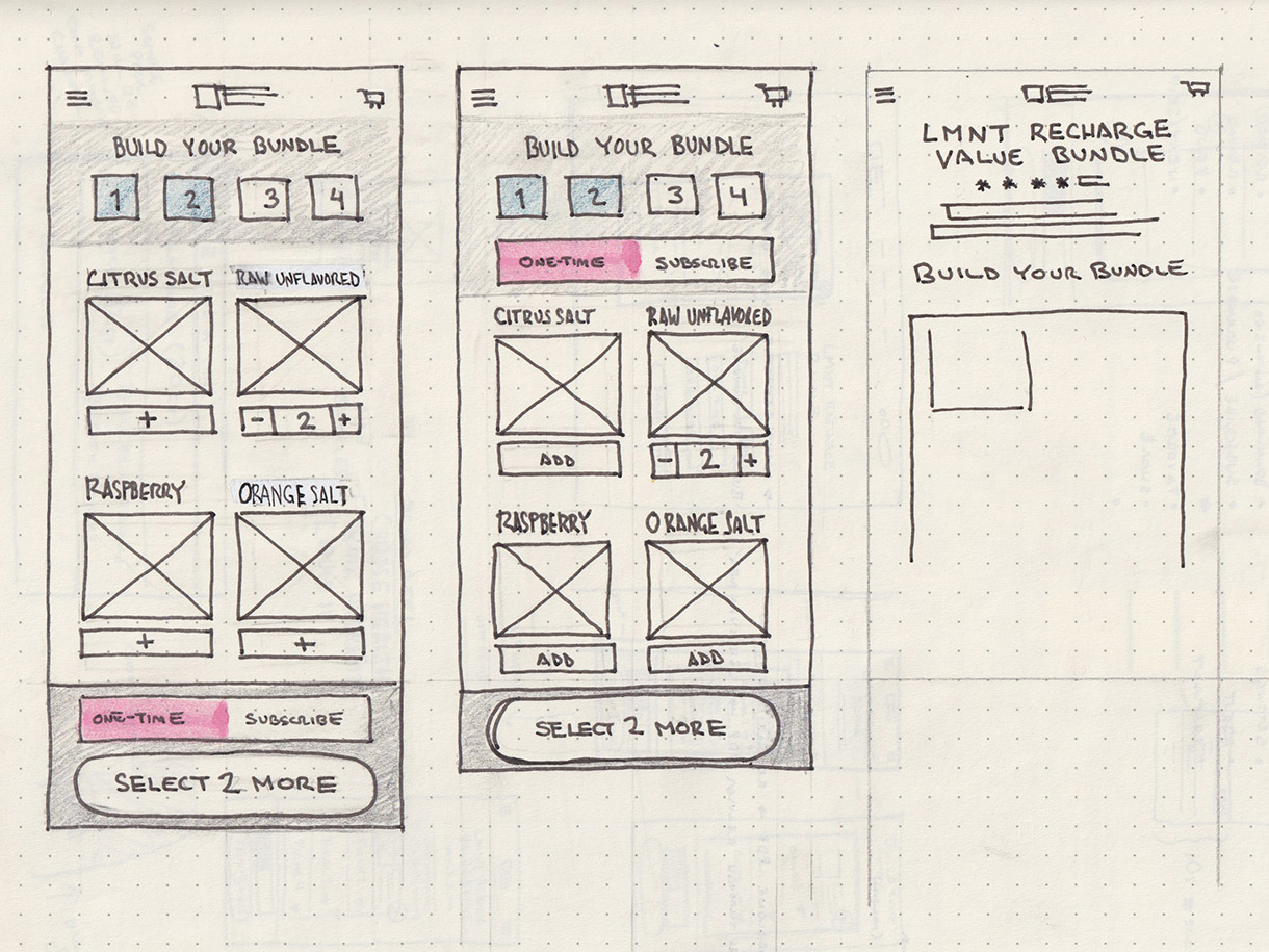
Initially, I explored all of these considerations through a rapid ideation session using paper and pencil. I then returned to my notes and drawings to iterate and refine ideas. I focused on mobile in order to ensure the transaction could be completed with no (or minimal) scrolling and took advantage of sticky page elements (header and 'Add to Cart' CTA) when scrolling was required. The obvious challenge was to accommodate a growing list of product variants (in this case, flavours).
I explored the use of a pop-up tray, dropdown(s), and numeric fields to house and facilitate flavour selection. For feedback, I iterated on the progressive disclosure of discrete steps ('Add item', 'Add second item', etc.) via numeric countdown, visual representation of a box filling up, and the active/inactive state and dynamic labeling on the primary 'Add to Cart' CTA.
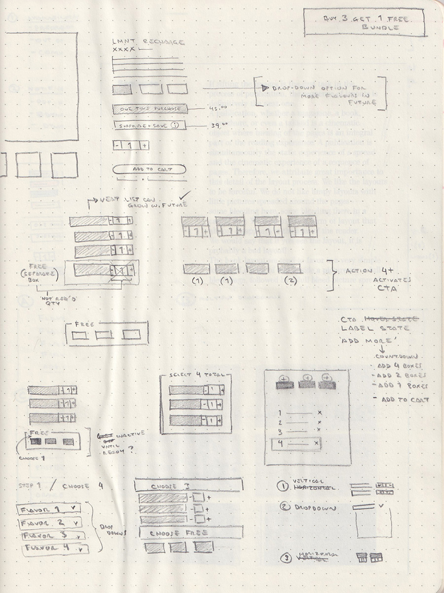
Sketching flavour selection options.
Some variants for flavour selection.
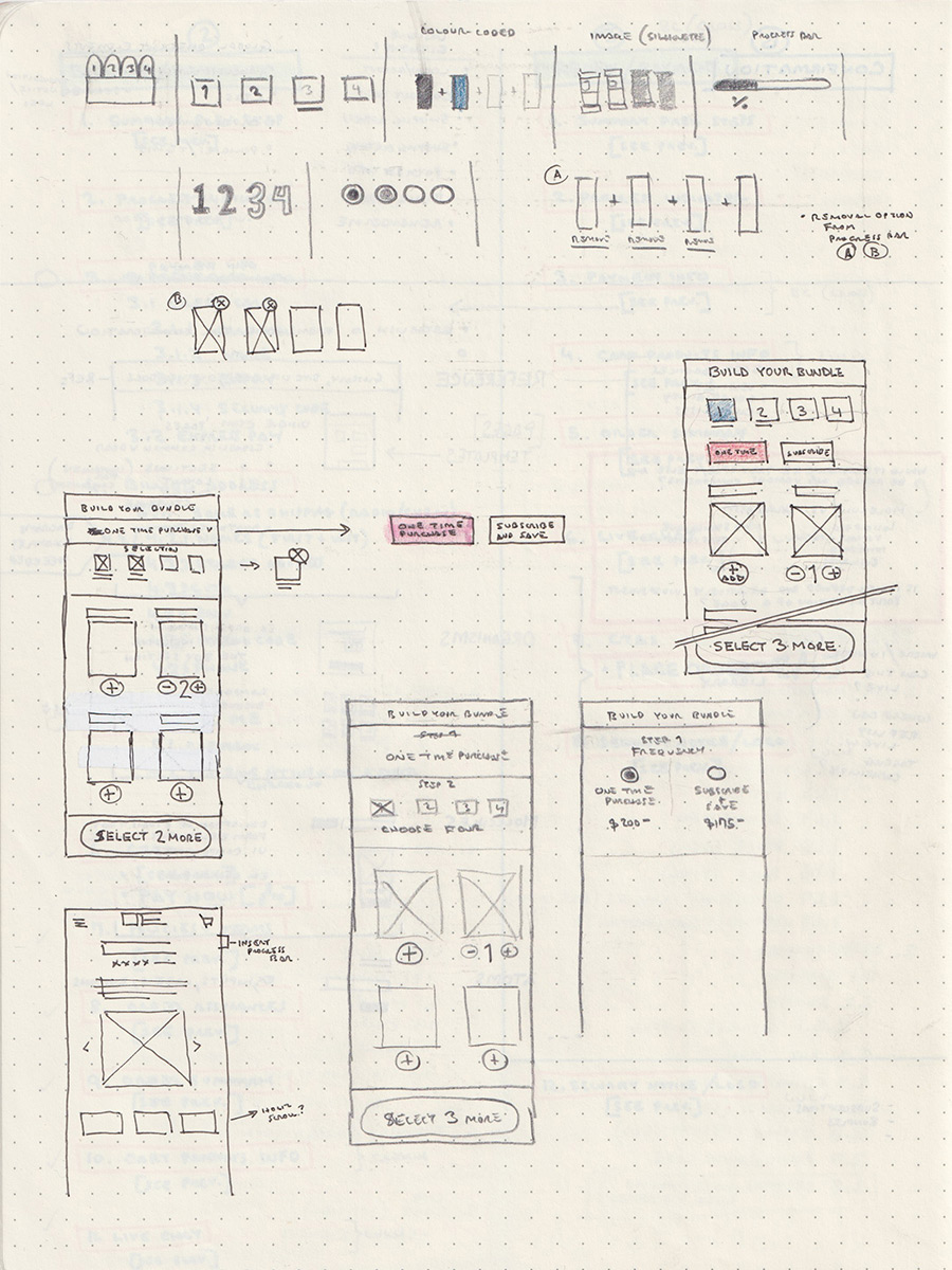
Progress and feedback exploration and first mobile screen layouts.
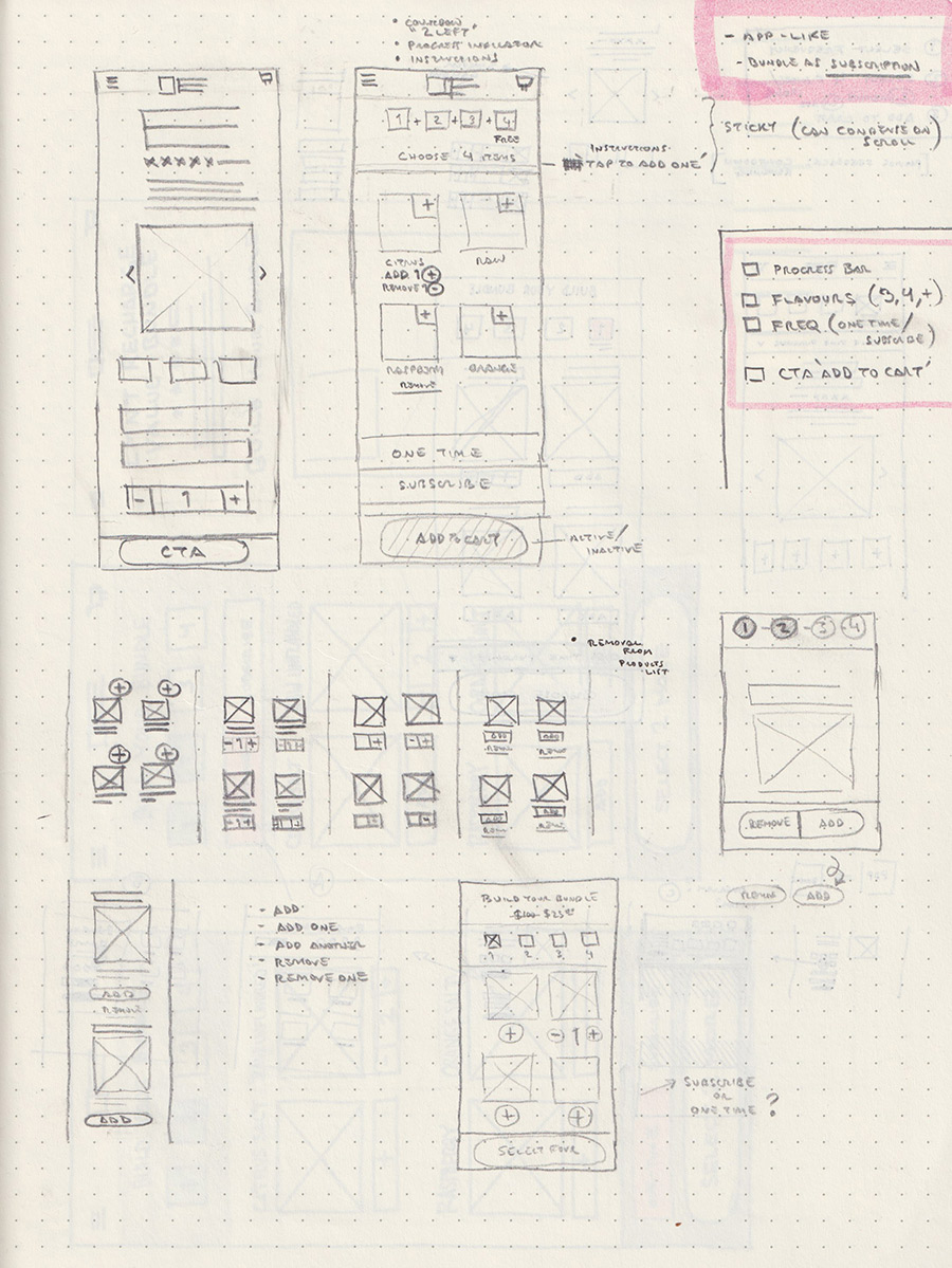
More mobile layouts with grid-based flavour selection presentation.
Introduction of the popup tray and a visual representation of the product bundle filling up.
Two options of sticky elements: header and CTA.
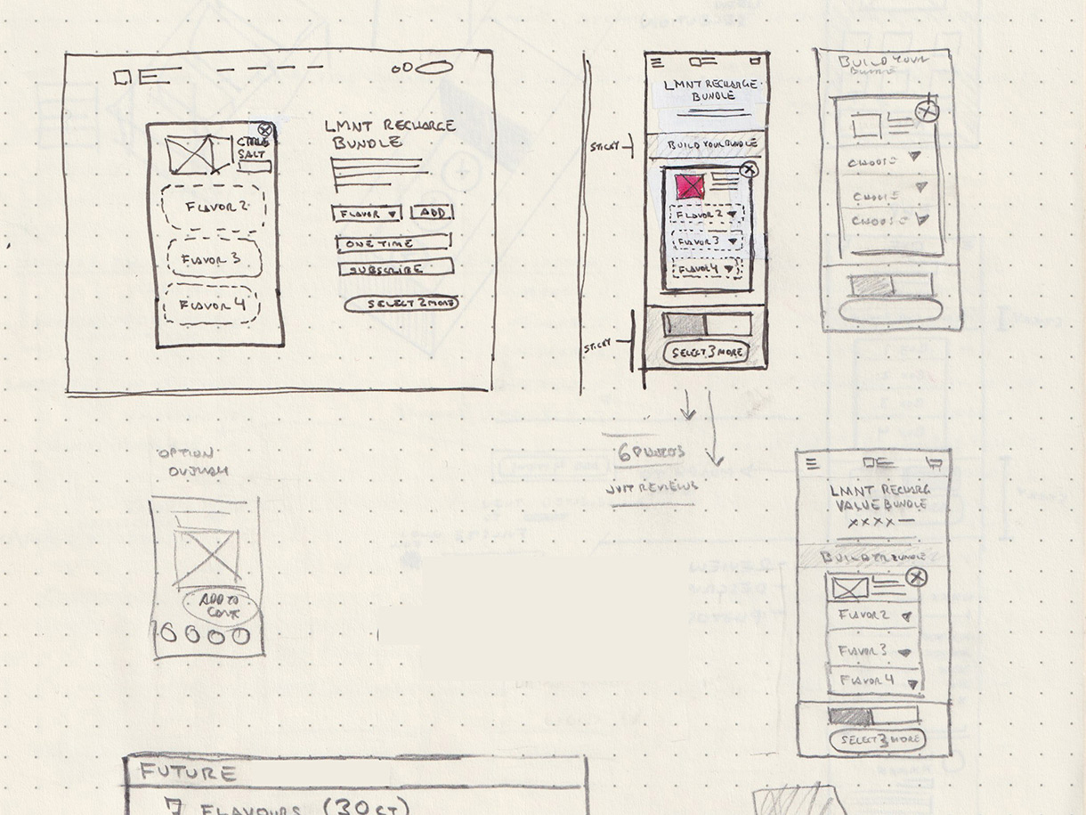
Rough sketch of desktop layout side-by-side with mobile.
Notes and sketches from a rapid ideation session. Exploration of flavour option presentation, selection methods, and feedback display.
Wireframes
The team, with some client feedback from the initial paper sketches, chose two design concepts to move to the next stage.
DESKTOP (VARIANT 1)
The first closely mimicked the existing product page UI. It had the benefit of utilizing an interface already familiar to users and would be both cost-effective from a design and development perspective. Unfortunately, however, the design would not scale well with the addition of more flavours in future and would lack the visual interest and impact the brand was hoping to accomplish with the launch of a new product.
Variant 1 is closely modeled on the site's existing flavour selection component. Feedback and instructions are provided by the primary CTA's state (active/inactive) and dynamic label.
DESKTOP (VARIANT 2)
The second design utilized a popup tray, a new interactive element for the website, and visually represented a product bundle pack filling up. This design would have the visual impact desired by the client, but would add a new (untested) element to the site's existing design and increase both design and development time.
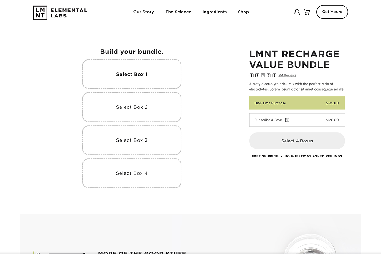
Variant 2 utilizes a popup drawer for flavour selection. Instructions and feedback provided on drawer header as well as primary purchase CTA state (active/inactive) and label.
MOBILE
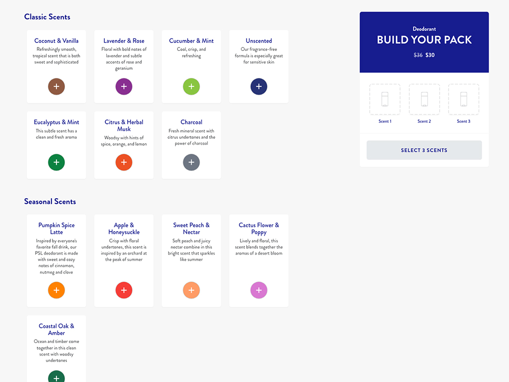
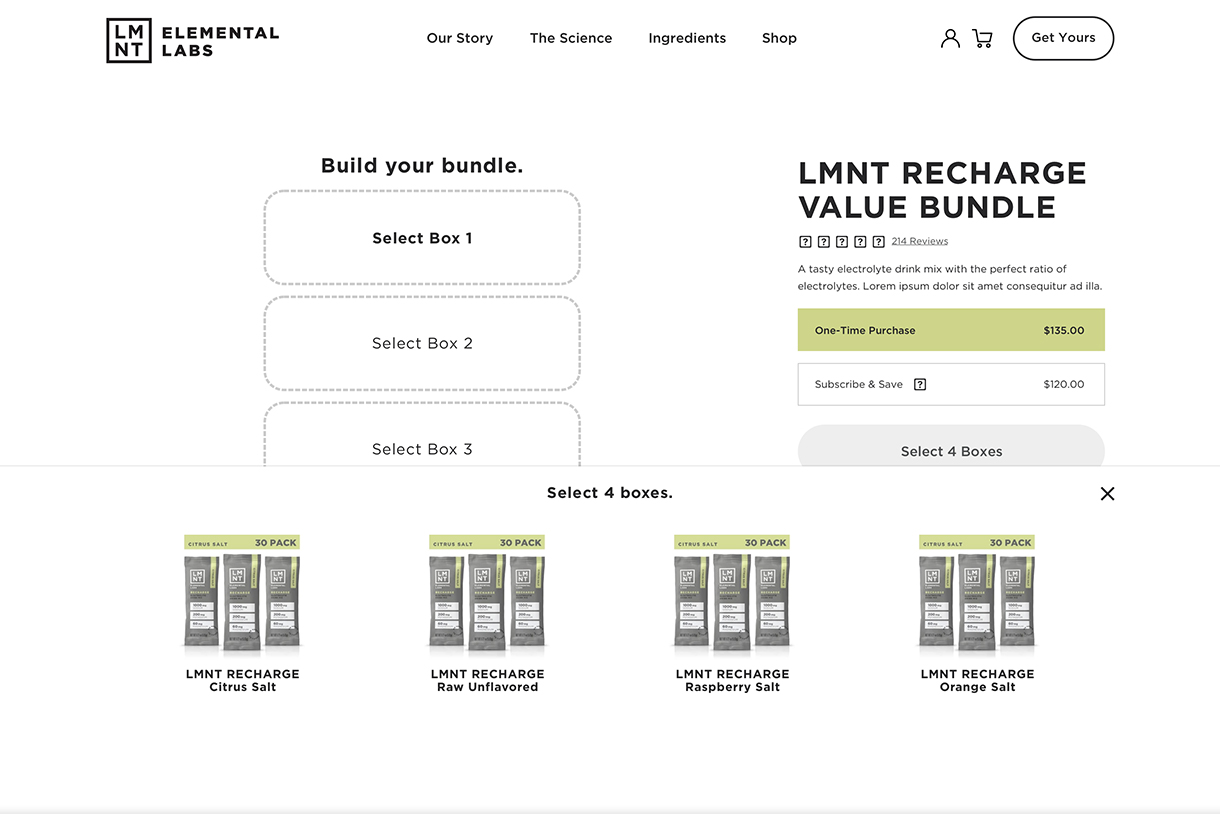
Variant 2 was selected to iterate further and flesh out into mobile. In order to present flavour-variants, I explored both the use of product photography and colour-coded icons. Icons had several advantages. From a dev perspective they were easier to maintain, lightweight and fast loading; and from a design perspective they were more compact, allowed more whitespace and simplified the interface. One did have to be conscious of vision-impaired users, however, when it came to color choice and contrast.
Consideration was also made for future flavours. The popup tray had plenty of real estate on desktop but on mobile two options presented themselves: increase rows and/or columns to form a grid (with the potential of a vertical scroll) or a single row with horizontal scroll (additional flavours hinted at, but hidden, off screen).
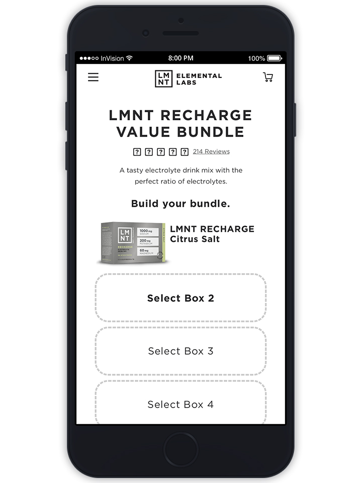
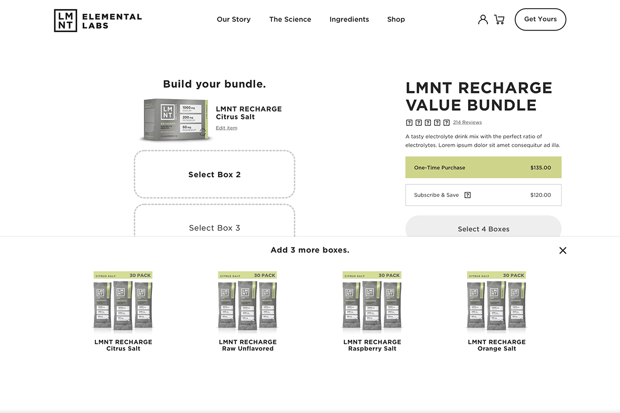
'Build your bundle' one flavour selected mobile wireframe.
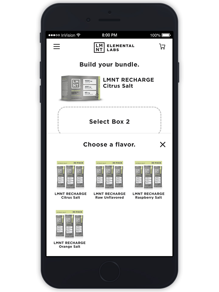
Choose a flavour selection tray with product photos.
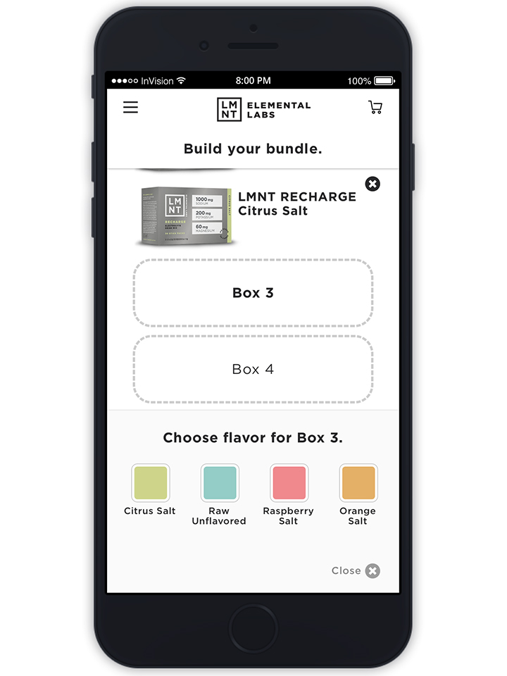
Choose a flavour selection tray with colour-coded icons.
In addition, the current mobile PDP pattern utilized a sticky 'Add to Cart' CTA. If a user scrolled down the page, they would have to return to the top of the page in order to review or modify the default ('one time') purchase frequency. By adding the frequency toggle to the sticky element immediately above the CTA, users had the information ready at hand thereby speeding up the transaction process.
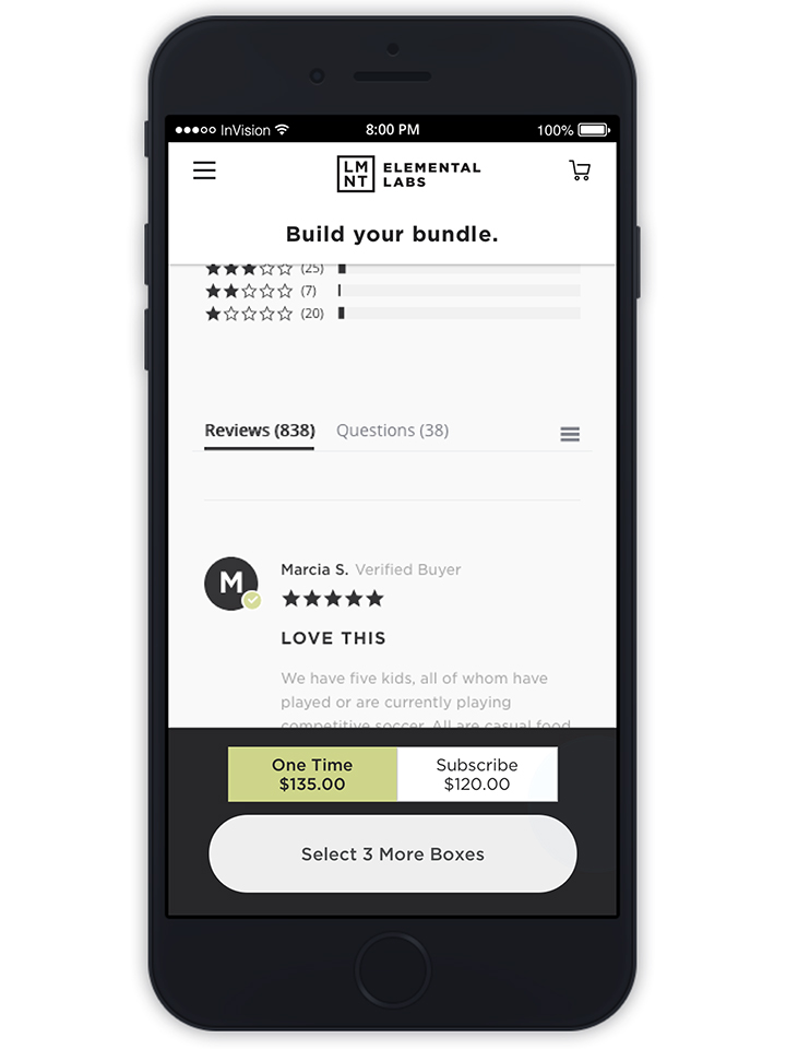
Purchase 'one time' or 'subscribe' toggle added to sticky CTA.
Conclusion
Utilizing existing design conventions that are familiar to users is a sound strategy. Customization can, however, challenge these conventions since the nature of things like ' bundles' and 'gift boxes' are often unique to a particular product category or brand. In addition, variants change, and frequently increase, so simply finding an efficient way to house the options (with the potential for growth) is a significant concern. It is crucial find a balance as these decisions will directly affect the transaction process for the user.
Copyright © 2020 Oliver Tomas. All rights reserved.