EXHIBITION DESIGN
Modern in the Making: Post-War Craft & Design in British Columbia
Research, ideation and exhibition design with Goodweather Studio for an exhibition about post-war craft and design in British Columbia.
2020.05.09
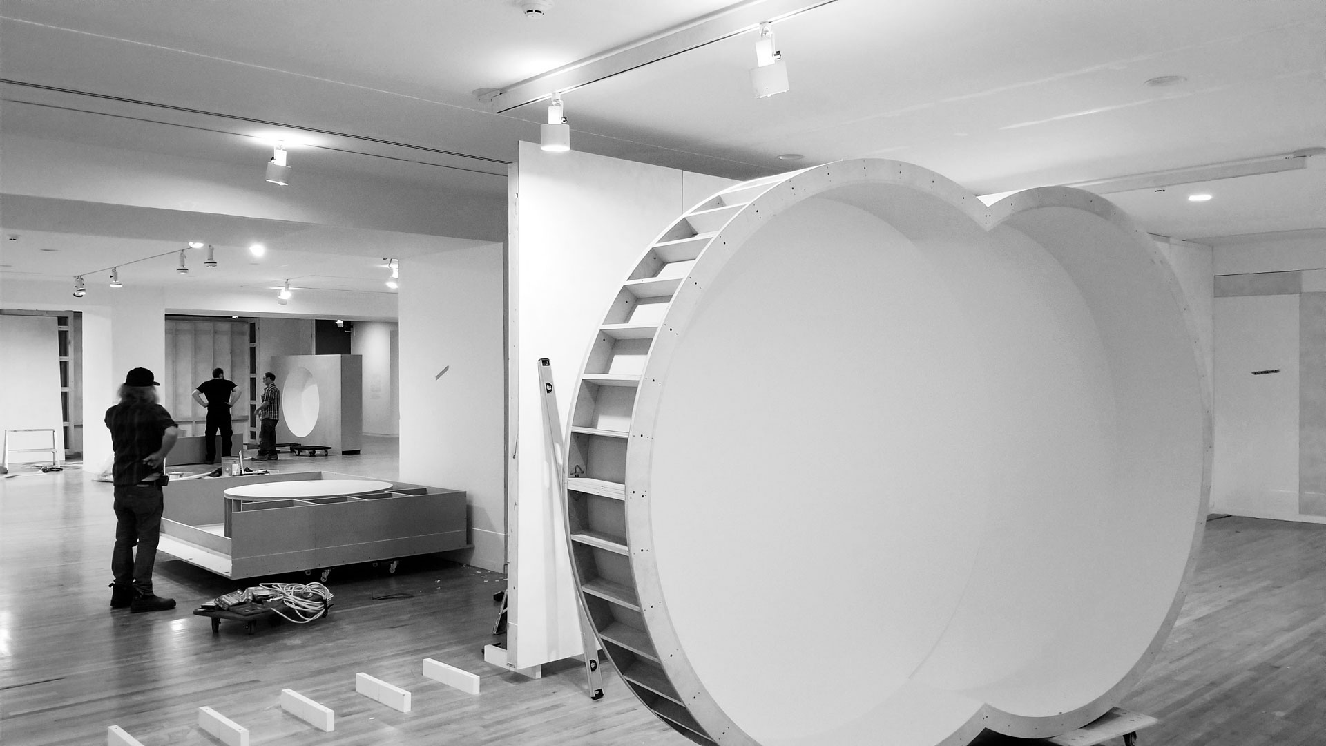
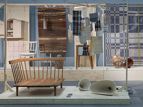
Modern in the Making installation in progress at the Vancouver Art Gallery. (Photo: Goodweather Studio)
PROJECT DETAILS
CLIENT
Vancouver Art Gallery (via Goodweather Studio)
ROLE
UX designer & researcher
TEAM
Oliver Tomas, Goodweather Studio, Vancouver Art Gallery (Curatorial)
RESPONSIBILITIES
Research, ideation and design
TIMEFRAME
12 weeks (intermittent)
Overview
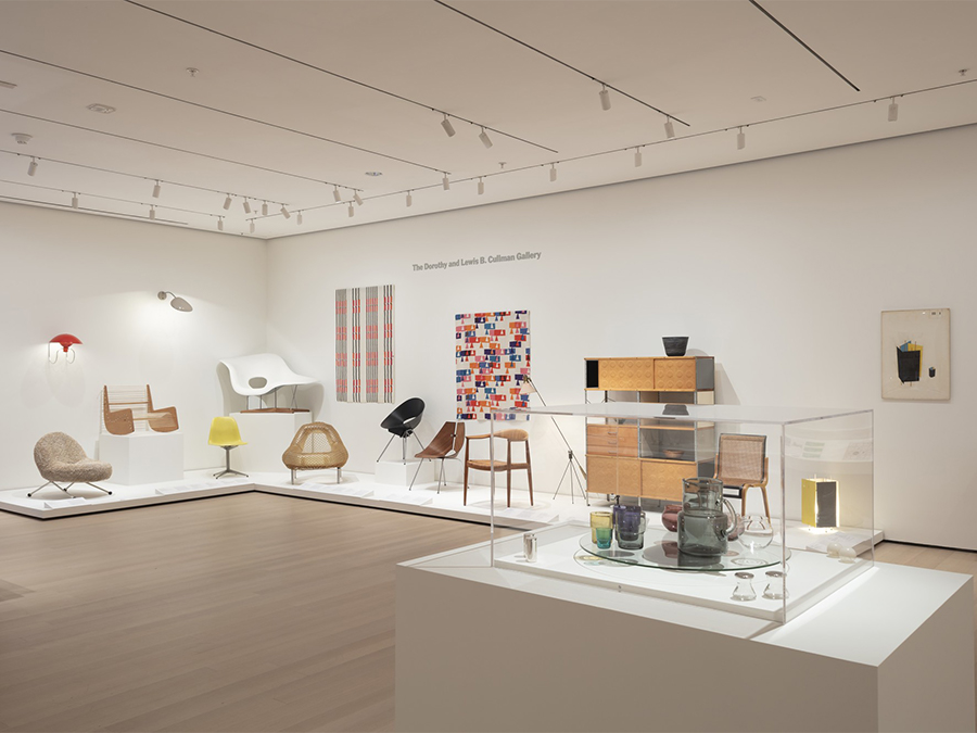
I was hired by Goodweather Studio to assist in the design of an exhibition at the Vancouver Art Gallery. The exhibition presented post-war craft and design in British Columbia and comprised roughly 300 individual pieces produced over a three decade period (1949 to 1979).
The exhibition space utilized the entire first floor of the Vancouver Art Gallery, approximately 10,000 sq ft, and displayed a range of objects including furniture, ceramics, jewelry, fashion and textiles.
I was responsible for assisting Goodweather with research, ideation, concept deveopment and design. This woud translate into the design of the exhibition space, all fixtures, some graphical elements and the title wall.
Project Goals
- Celebrate and show the significance and quality of British Columbia's post-war craft and design output.
- Engage visitors through unique fixtures, spatial layout and display interaction.
- Effectively display content in order to support discovery, investigation, education, as well as reflection and quiet contemplation.
—From the curatorial introduction, Vancouver Art Gallery.
In the three decades following WWII, thousands of people moved to British Columbia seeking the benefits of its resource-based economy, mild climate, natural amenities and inventive spirit. In this optimistic post-war environment, unique aspects of culture began to develop throughout the province. While histories of BC modern art and architecture have been investigated through exhibitions and publications over the last several decades, the equally proliferous post-war craft and design activities that also reflect many of the modern characteristics of the visual arts, remain largely undocumented. This exhibition aims to identify the most significant and unique examples of BC furniture, jewelry, fashion, ceramics and textiles produced between 1945 and the 1970s and articulate how and why these emerged in British Columbia during that time.
Research
We set out to collect as much information as possible. We needed to know what we were working with (content, space, people, timeframe, etc.); what had been done in the past and by whom; what was being done in other, semi- or unrelated, fields that we could apply to our project; and what, in the end, we hoped to accomplish.
We examined mid-century and more recent exhibitions that dealt with modern design and craft. We wanted to see how items were displayed, the spacial layout, fixtures and visual elements. We also looked at the motivating factors for these shows and what they were trying to communicate. During the 1950s and 1960s exhibitions were promoting a new way to live, new materials, a new aesthetic. More recent shows, displaying the very same items, were now engaging in a more complex historical narrative raising broader issues and tying the past to the present.
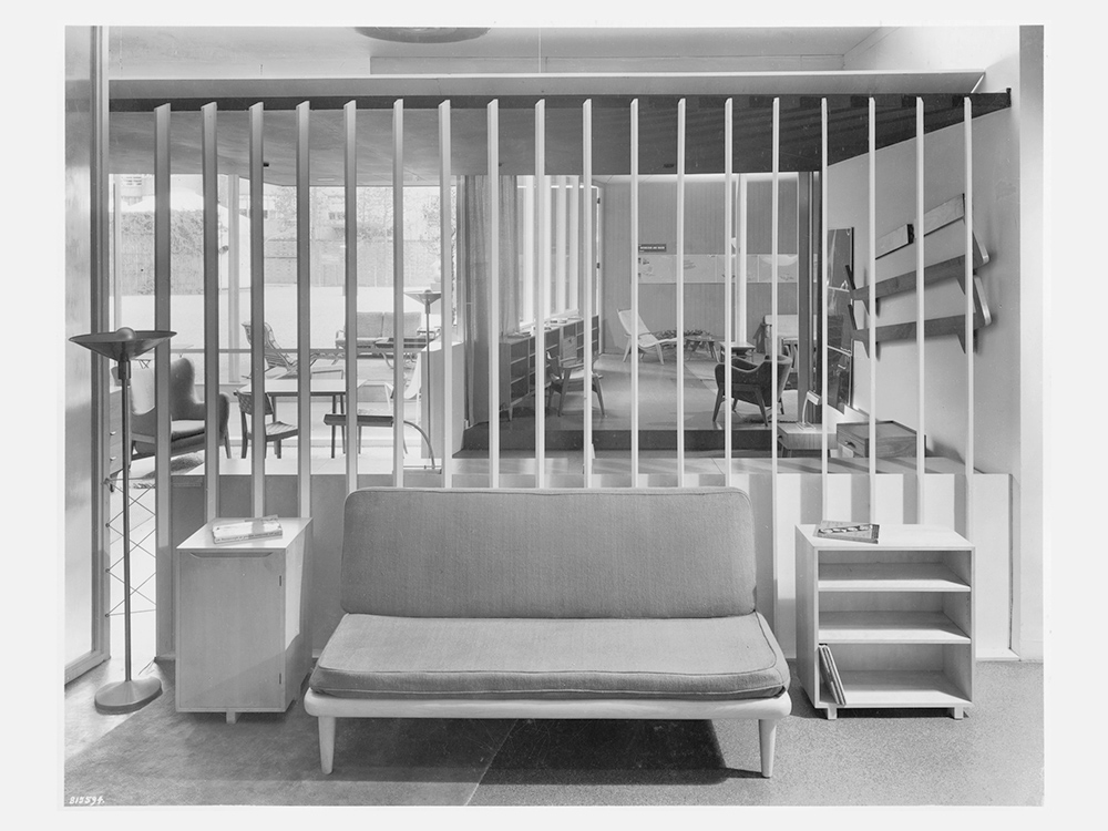
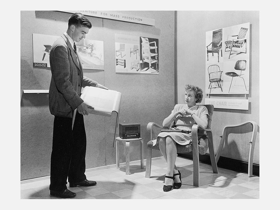
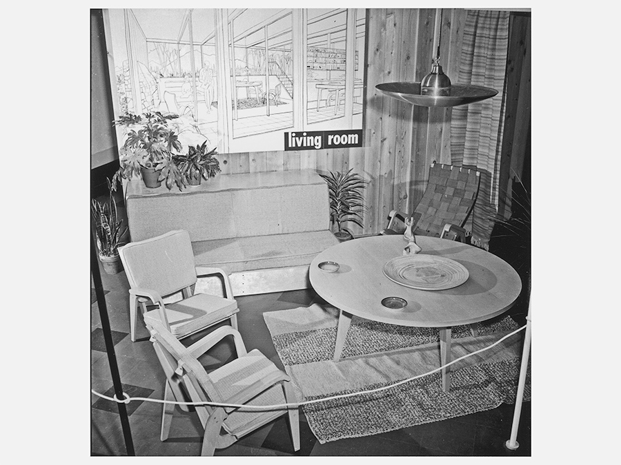
We looked at many past exhibitions and installations, both Canadian and those originating abroad. These included, among others: the Museum of Modern Art's Organic Design in Home Furnishings (1941), Canada's own Design in Industry (1945) and Design for Living (1949) both of which exhibited at the Vancouver Art Gallery, the quintessential traveling modernist showcase Design in Scandinavia (1950), Canada's display at the Milan Triennale (1954) as well as more local installations such as visitors would see at Toronto's Design Centre and even retail shops.
Organic Design in Home Furnishings exhibition, 1941 (Source: MOMA)
Organic Design in Home Furnishings exhibition, 1941 (Source: MOMA)
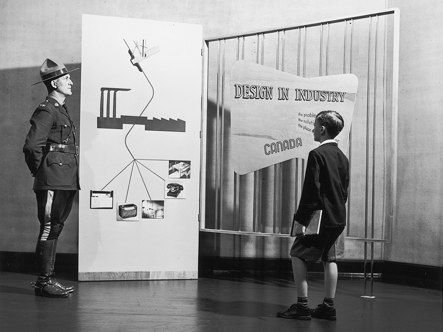
Design in Industry exhibition, 1946 (Source: VAG)
Design in Industry exhibition, 1946 (Source: VAG)
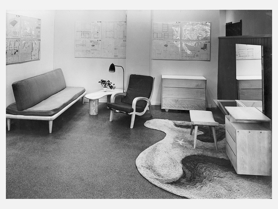
Design for Living exhibtion, 1949 (Source: VAG)
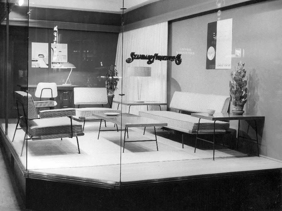
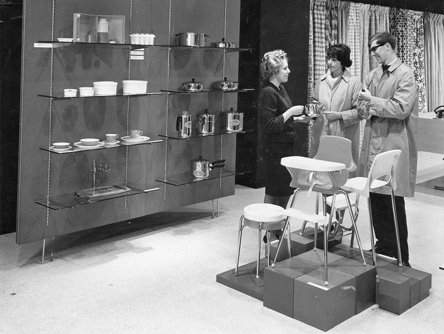
Retail display at Standard Furniture, Victoria, c. 1950s (Source: VAG)
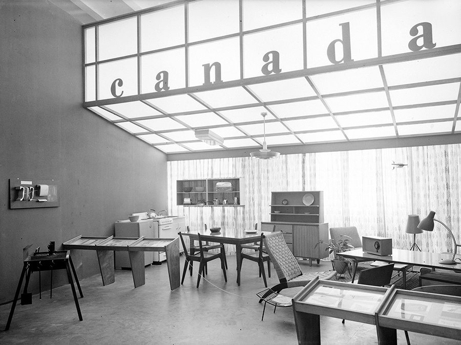
Canada' exhibit at the Milan Triennale, 1954 (Source: VAG)
Design Centre, Toronto, c. 1960s (Source: VAG)
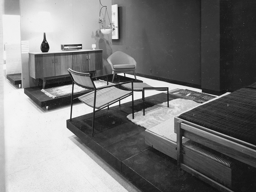
Design Centre, Toronto, c. 1960s (Source: VAG)
Examples of design exhibitions and retail displays c. 1950-60. These often featured vignettes of domestic spaces and/or focused on (new) materials and innovative manufacturing methods in order to promote products for both national and international markets.
For more recent expositions, we examined: West Coast Modern (1988), A Modern Life: Art and Design in British Columbia 1945-1960 (2004), the Art Gallery of Greater Victoria's The Modern Eye: Craft and Design in Canada 1940-1980 (2011), True Nordic: How Scandinavia Influenced Design in Canada (2017), as well as other, non-institutional, environments such as eminent furniture and design trade fairs: Stockholm Furniture and Light Fair, Maison et Objet, Salone del Mobile, ICFF, London Design Festival, etc.
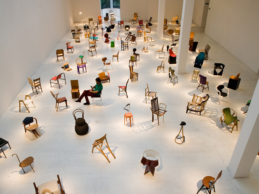
100 Chairs in 100 Days exhibition, 2009 (Source: Modern Institute)
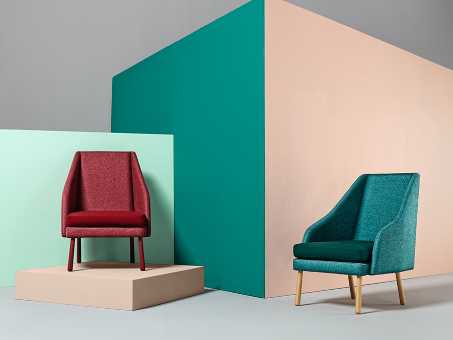
Mamut Chair art direction, 2015 (Source: Missana)
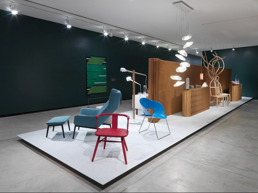
True Nordic exhibition, 2017 (Source: VAG)
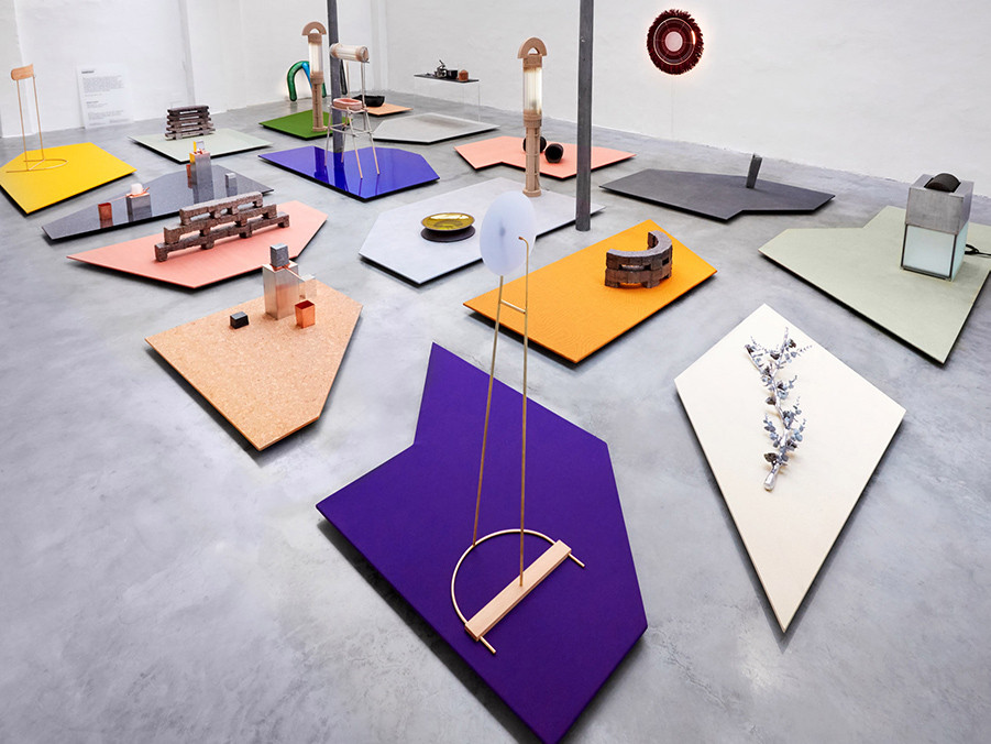
London Design Fair, 2017 (Source: Dezeen)
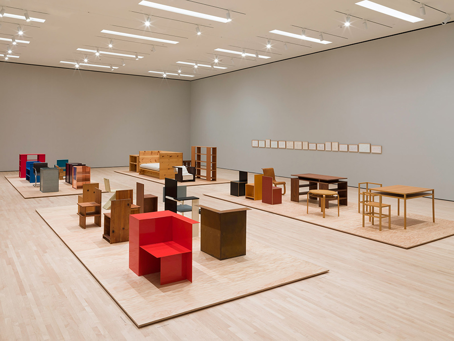
Donald Judd: Specific Furniture exhibition, 2018 (Source: Dezeen)
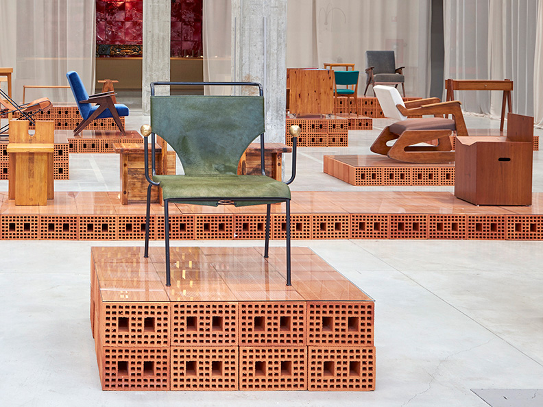
Nilufar Depot at Milan Design Week, 2018 (Source: Sight Unseen)
Jumbo's Neotenic collection art direction, 2018 (Source: Dezeen)
Stockholm Furniture and Light Fair, 2019 (Source: Interior Design)
The Value of Good Design exhibition, 2019 (Source: MOMA)
Examples of contemporary design display as seen in gallerys, trade fairs and promotional images. Material, shape, colour and spacial layout are manipulated in a variety of ways to engage visitors/viewers.
We scoured publications and photographs from the period to get a sense of domestic space and architecture, materials, aesthetics and trends. For this we relied on the architectural photography of Selwyn Pullan, issue's of Western Homes and Living, DIY and inspirational publications by Sunset, exhibition catalogues, industrial product catalogues, and The Canadian Architect magazine.
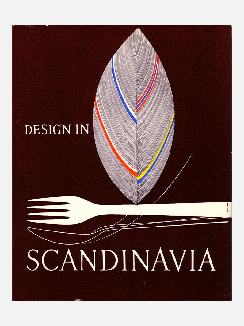
Design in Scandinavia catalogue, 1954 (Source: Oliver Tomas)
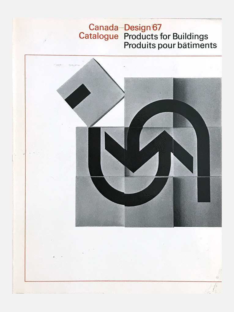
Canada –Design '67 Catalogue, 1967 (Source: Oliver Tomas)
Design for Living exhibtion catalogue, 1949 (Source: VAG)
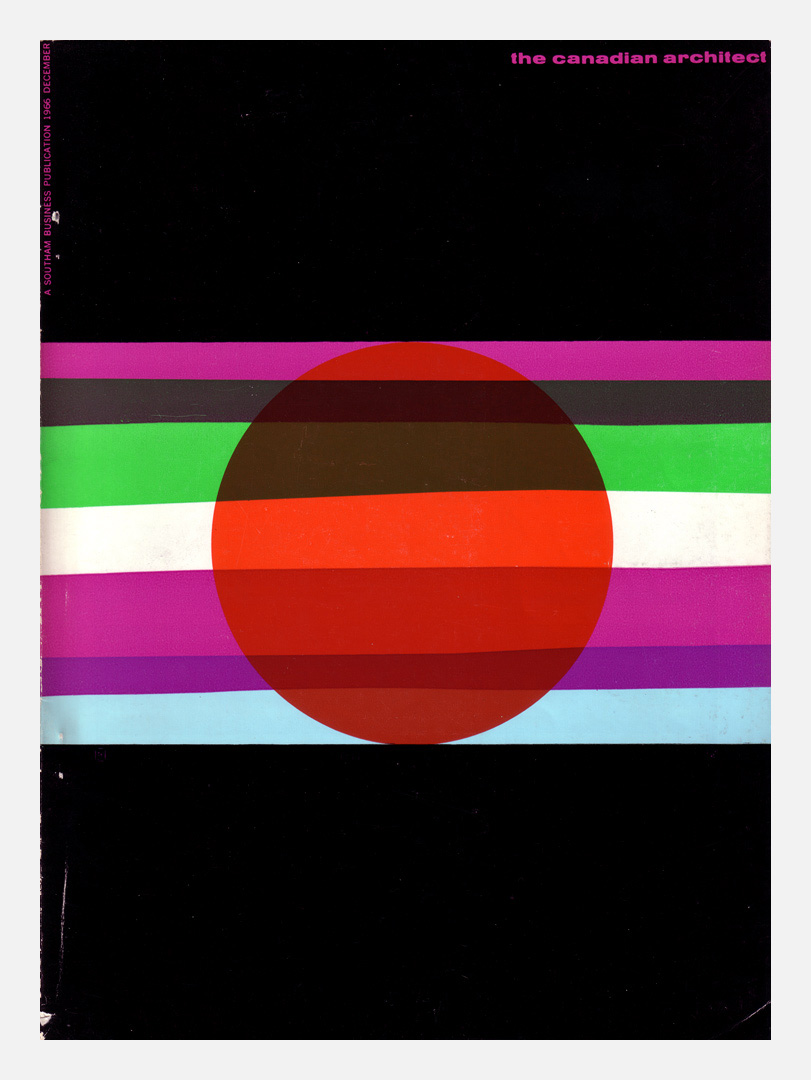
The Canadian Architect magazine, 1966 (Source: Oliver Tomas)
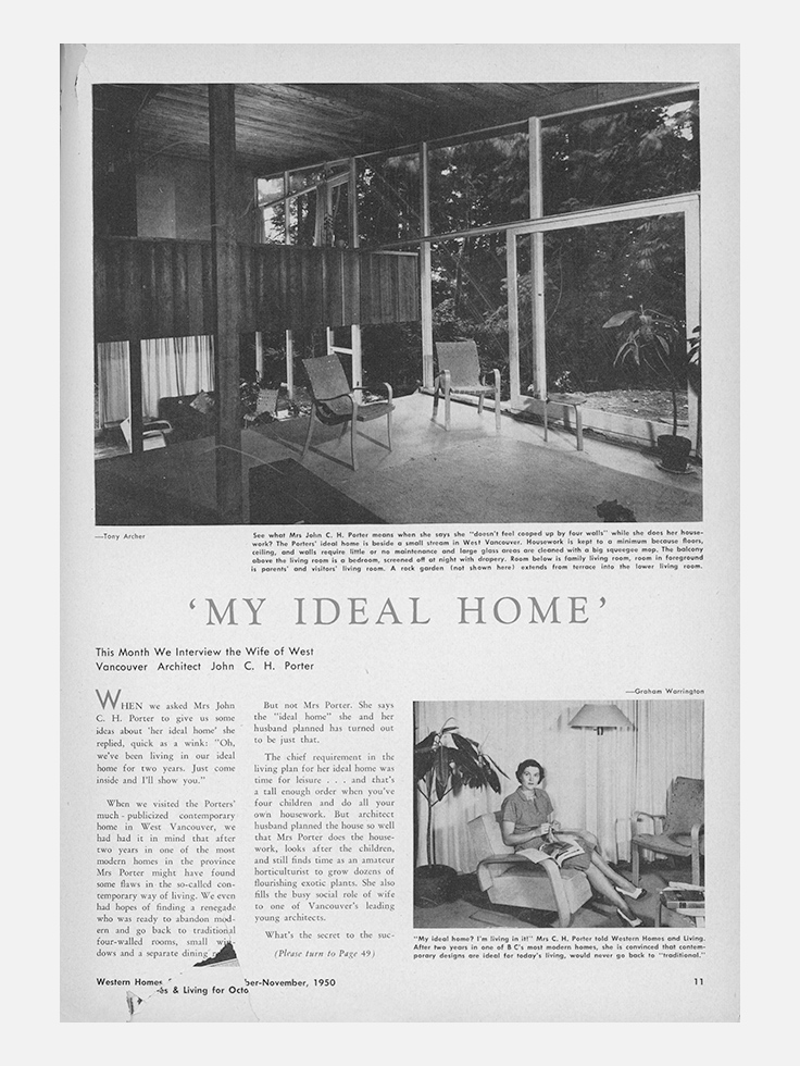
Western Homes and Living magazine, 1950 (Source: VAG)
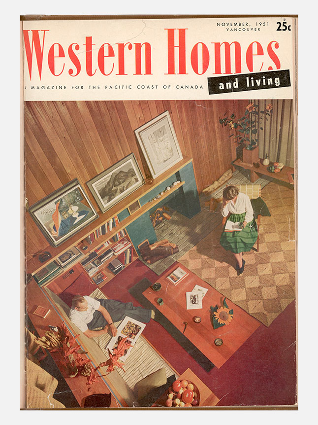
Western Homes and Living magazine, 1951 (Source: VAG)
Examples of printed resources used for research and inspiration. These included magazines and catalogues from the 1950s-70s as well as catalogues and books from mid-century art, design and architecture retrospectives.
We completed our discovery phase by taking a tour of the current exhibition (Alberto Giacometti: A Line Through Time) to observe how visitors moved and interacted. We wanted to see the space (context), who was there (visitors), and what they did (behaviour, interaction).
At this point, we had amassed quite a body of research and had a better sense of both the historic context of the exhibition as well as the physical exhibition space. We still had the challenge of finding a unique approach that would accomplish our project goals but at least now our conversations and ideas were more focused.
All the same, questions abounded: How should this exhibition relate to other historic and more recent ones? Should it be similar or different? Should it be a step back in time, perhaps featuring self-contained vignettes, and risk anachronism? or a contemporary display of individual items on neutral plinths like so many others? Or a hybrid? Where do we go from here?
Planning
Broad strokes out of the way, we started distilling our research findings into a design direction. Now the ideation process formally started.
In order to support the free flow of ideas we did virtually no editing early on. We made hundreds of thumbnail sketches and notes. Ensuring we looked at the project from different angles we brainstormed, made word and concept maps, and created user stories. We were looking to establish an overarching concept for fixtures, spacial layout, flow, and appearance.
Early on, I captured a body of keywords from the original project brief and other internal documents in order to look for, and highlight, key exhibition themes, and possible points of inspiration.
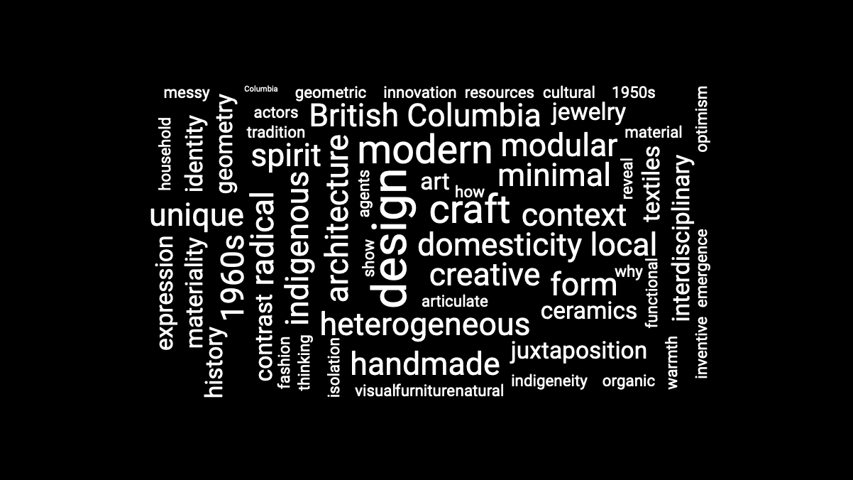
Word cloud created from project documents. Keywords increase in scale with frequency of use. A useful method to explore key themes and observe the language surrounding the project.
I created user stories to further flesh out what we had observed from our site visit. This way we could gain insight into what visitors might expect to see or do as well as provide an opportunity for us to review the broad spectrum of possible visitors. We wanted to make sure we had everyone in mind when creating the design concept.
We pared down the large amount of images we collected in our initial research to expose themes we could apply to our design. Many of these overlapped with words found in our word cloud. We took a closer look at the exhibition content as well as our collected body of art, architecture, building materials, patterns, colours, and aesthetics.
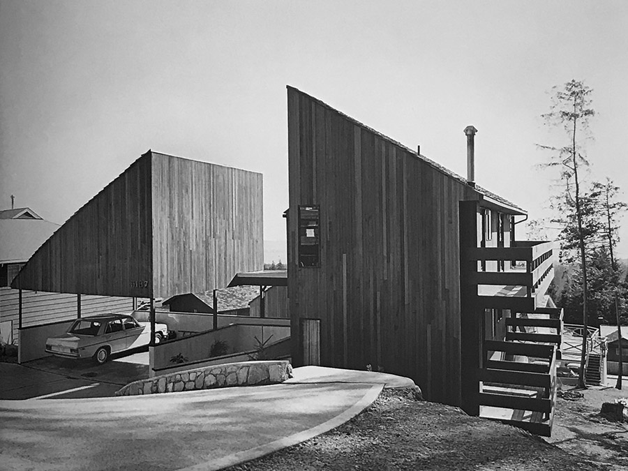
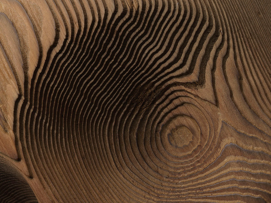
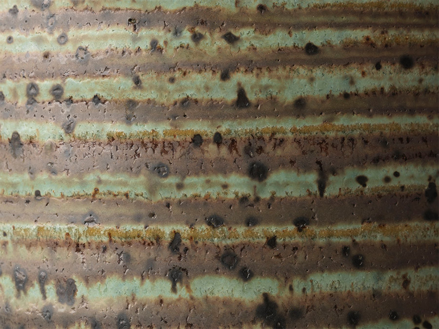
Architectural photograph (Source: Selwyn Pullan)
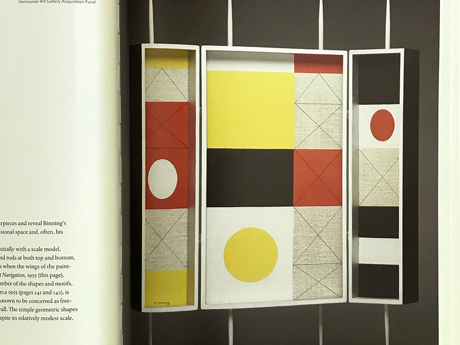
B.C. Binning Untitled, c. 1955 (Source: B.C. Binning)
Irene James (Source: VAG)
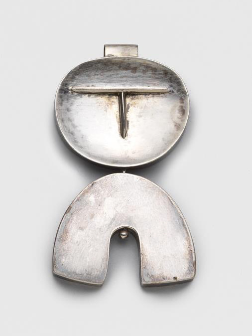
Doris Shadbolt Human-Form Pendant, 1955 (Source: VAG)
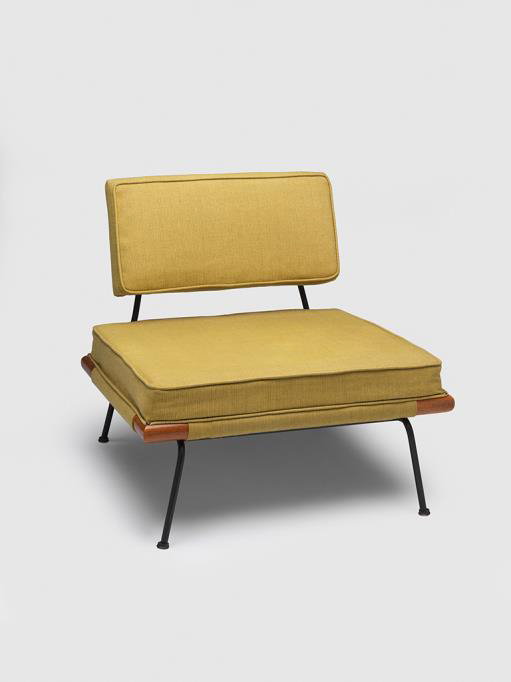
Morrison & Bush Lounge Chair (#141), 1951 (Source: VAG)
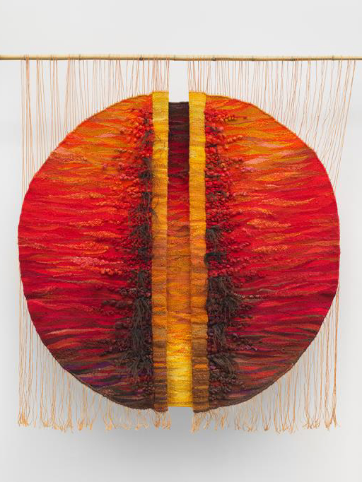
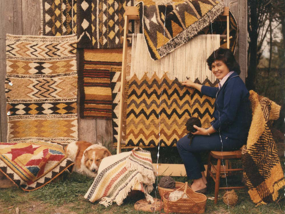
Joanna Staniszkis Untitled, 1975 (Source: VAG)
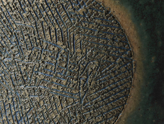
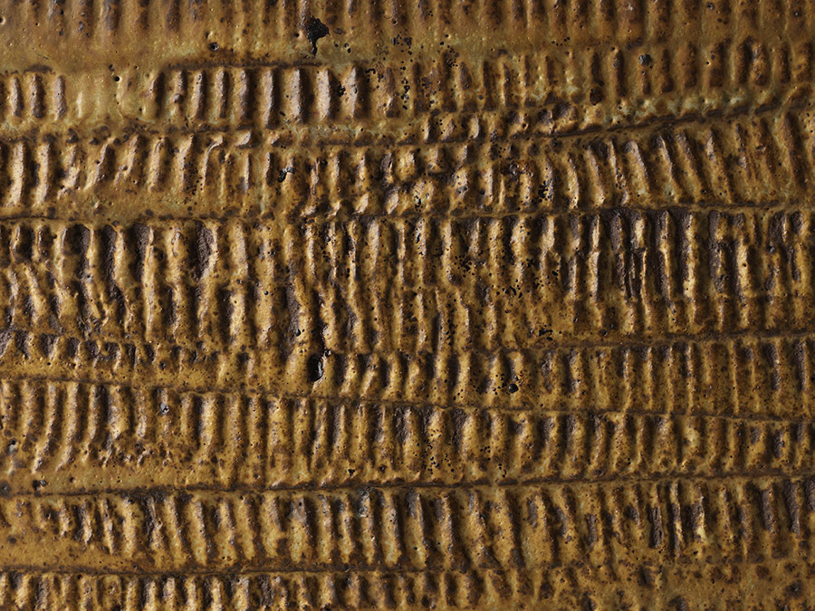
Hamilton vase detail (Source: VAG)
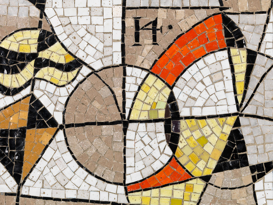
B.C. Binning mosaic detail (Source: VAG)
Ellen Neel Tsonokwa mask detai (Source: VAG)
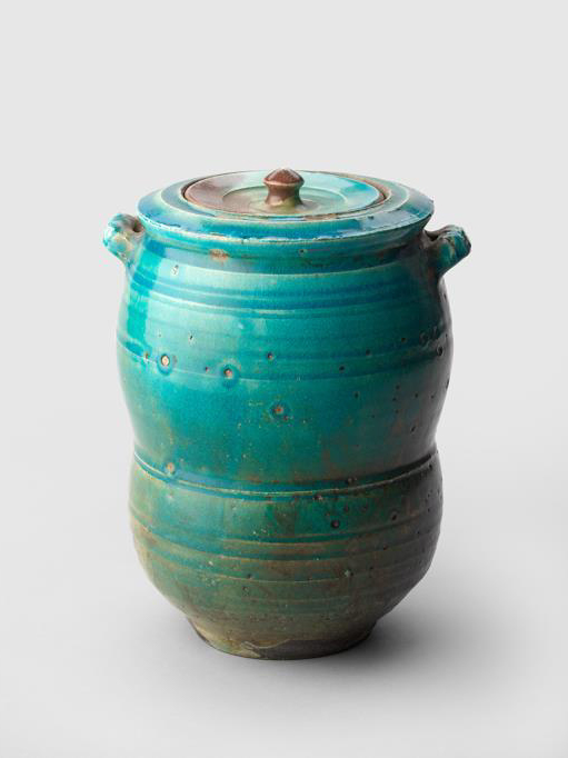
Wayne Ngan Raku Pot, c. 1970s (Source: VAG)
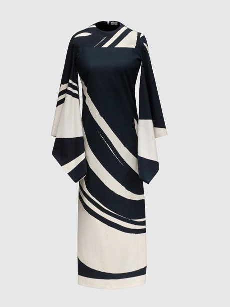
Mary Chang Dress, 1963–68 (Source: VAG)
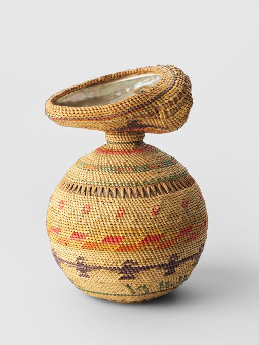
Anon. Nuučaan̓ ułʔatḥ weaver Ucluelet Basket, 1944 (Source: VAG)
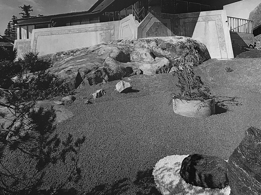
Architectural photograph (Source: Selwyn Pullan)
Ross vase detail (Source: VAG)
Dexter liquor set detail (Source: VAG)
Materials, textures, patterns, shapes, and colours derived from exhibition content and mid-century west coast architecture would all have an influence on our design direction.
Display considerations focused on fixtures and layout. These would be fundamental to how the exhibition was (physically) navigated and (conceptually) understood. How could we utilize shape, colour, placement and scale to affect the experience? What was the best way for visitors to interact with the broad range of items on display? How would people circulate through the space?
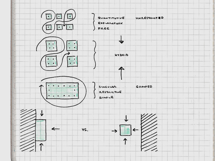
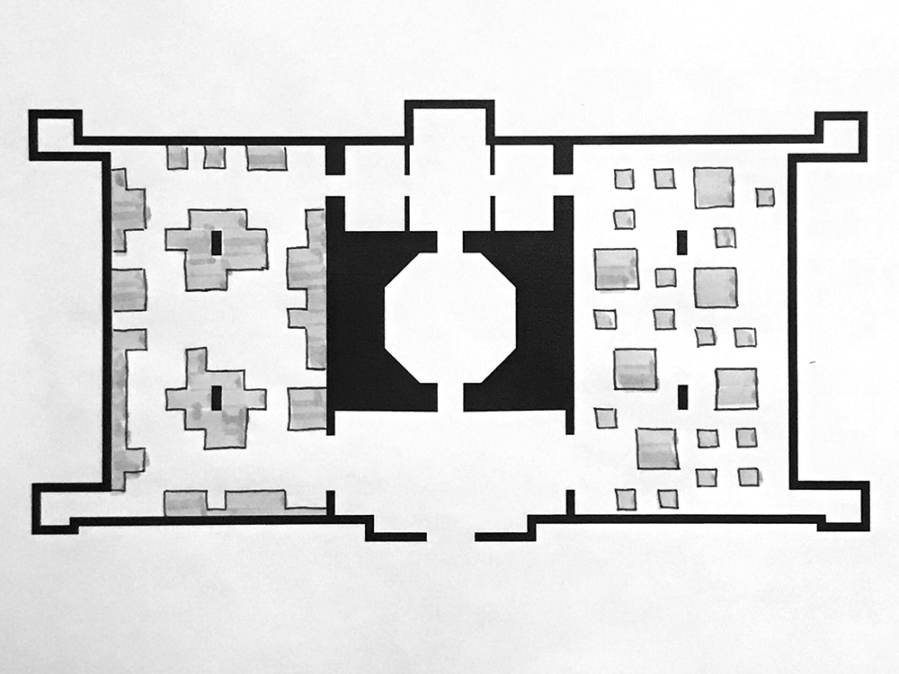
(Left) Early notebook sketches explore basic fixture modules and their placement. (Right) Fixture position and size affect opportunities for interaction and exploration.
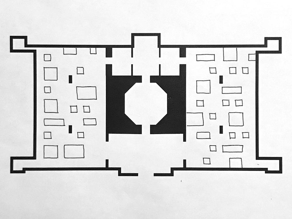
With a rough inventory of exhibition items in hand, we began examining floor plans of the gallery space more closely. We had a lot of diverse material to accomodate and some rough item groups and themes outlined by the curators.
I printed multiple blank floor plans to draw over and started with simple rectilinear shapes for the fixtures. I then overlayed these with a basic grid to help create structure. This exercise would help me get comfortable with the floor plan, even if we ended up doing away with a strict grid-based layout plan.
Adding a grid reinforced the convenience that a modular system would afford us. Since this nicely complemented the project in the form of a nod to modern production methods, not to mention, economy of production and visual simplicity, we explored what we could do with a modular unit. The simple rectalinear shape was a good start but seemed to lack any dynamism. We of course did not want the fixtures to compete with the items on display, but we thought we could push the concept a bit further.
What's more, we were working with a classical, symmetrical space with two equal halves flanking a central rotunda. These could mirror each other or play off of each other. The show had inherent dichotomies built in: craft/design, handmade/manufactured, etc. Could we incorporate this dualism in some way, both in the layout of the space and the fixtures themselves? Our floor plans and fixtures would become increasingly more expressive.
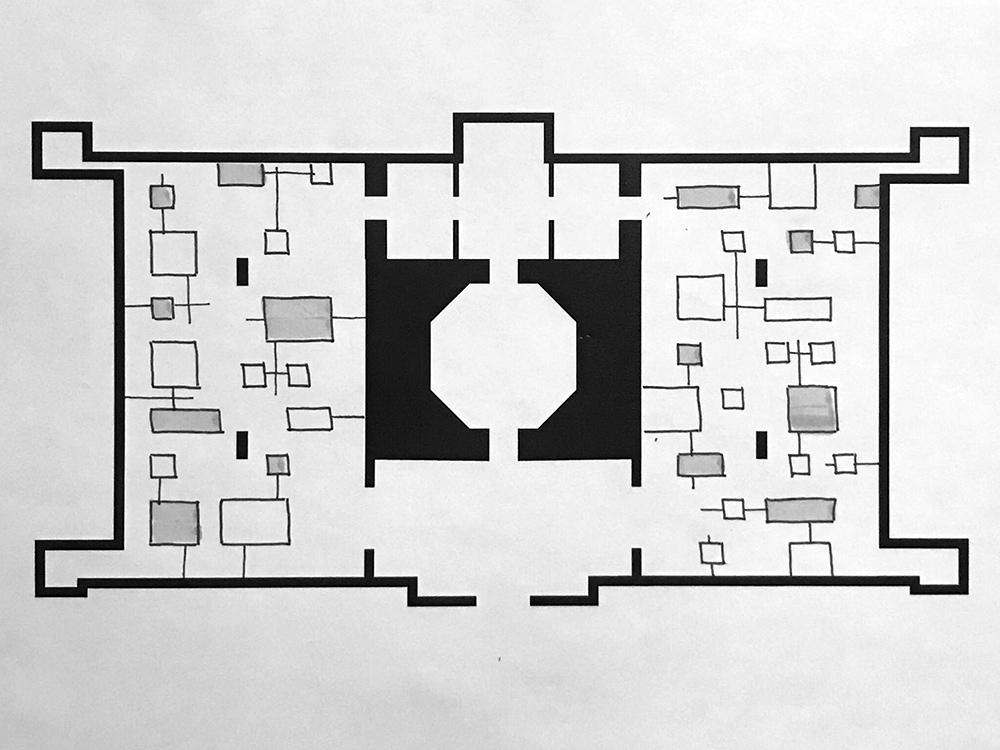
Sketches showing early development of grid-based spatial layout, basic modules and asymmetry of primary exhibition spaces. (Source: Oliver Tomas)
Early stages of a document capturing our layout iterations. Shown are the basic underlying grid, floor plans with pre-existing walls/fixtures, simple rectalinear modular units and more complex shapes and configurations. (Source: Goodweather Studio)
Modular was clearly the way to go. It would be more efficient and economical. Creatign a spatial grid would complement our modular units and provide clear options for spacial layouts. Because the gallery space had relatively low ceilings and the show content was largely three-dimensional, an open plan without walls would make the space feel larger and give visitors more vantage points to examine items on display and freedom to navigate the space.
At this point, we had some key concepts that would direct our designs going forward. Things like repetition, geometry, minimalism (colour and shape), and the handmade/manufactured dichotomy could be leaned on when further questions arose druing design. Things were increasingly focused. Sitting down to design would bring them into still higher fidelity.
Design
With some momentum, we moved into the formal design phase. It was time to refine our ideas and move them from paper sketches and basic floor plans into three-dimensional renders and, ultimately, a set of construction-ready drawings for production.
In order to do this, Goodweather Studio would do the heavy lifting and utilize their expertise in architecture and three-dimensional modelling software to bring our designs to life. At the same time, together, we continued pushing the design of our modular units and layout grid.
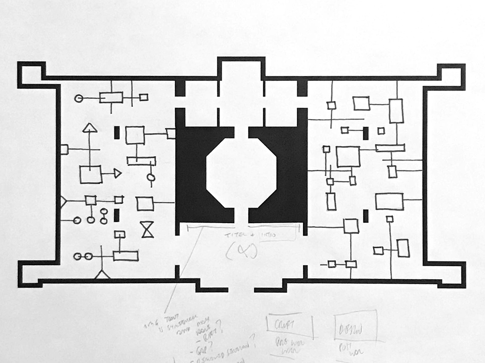
For our fixtures, we settled on three geometrical base units: square, triangle and circle. These shapes afforded us a good deal of visual variety and versatility when it came to configuration and placement. They also fit well with simple forms, textures and patterns used in modern art, architecture, craft and design. Combining, repeating, orienting, and juxtaposing these modules would work to accomodate the exhibition's varied content and offer a potential visual language to relate different groupings and content in the show.
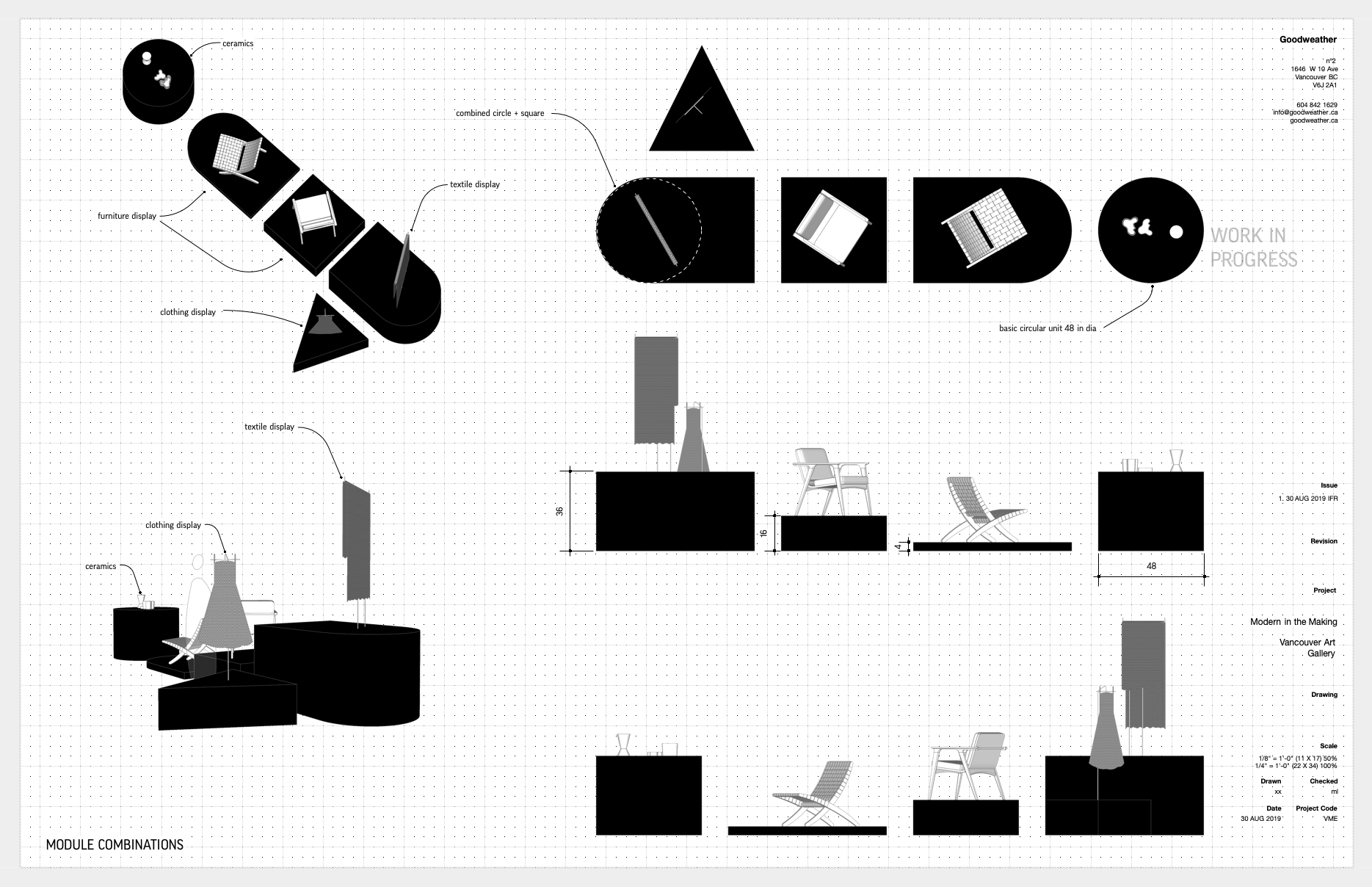
Display fixture shapes, dimensions and possible combinations. (Source: Goodweather Studio)
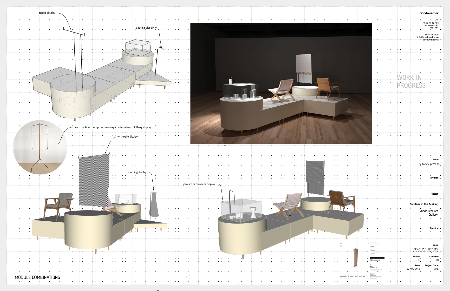
Drawing and preliminary rendering of fixture modules in combination with sample exhibition content. (Source: Goodweather Studio)
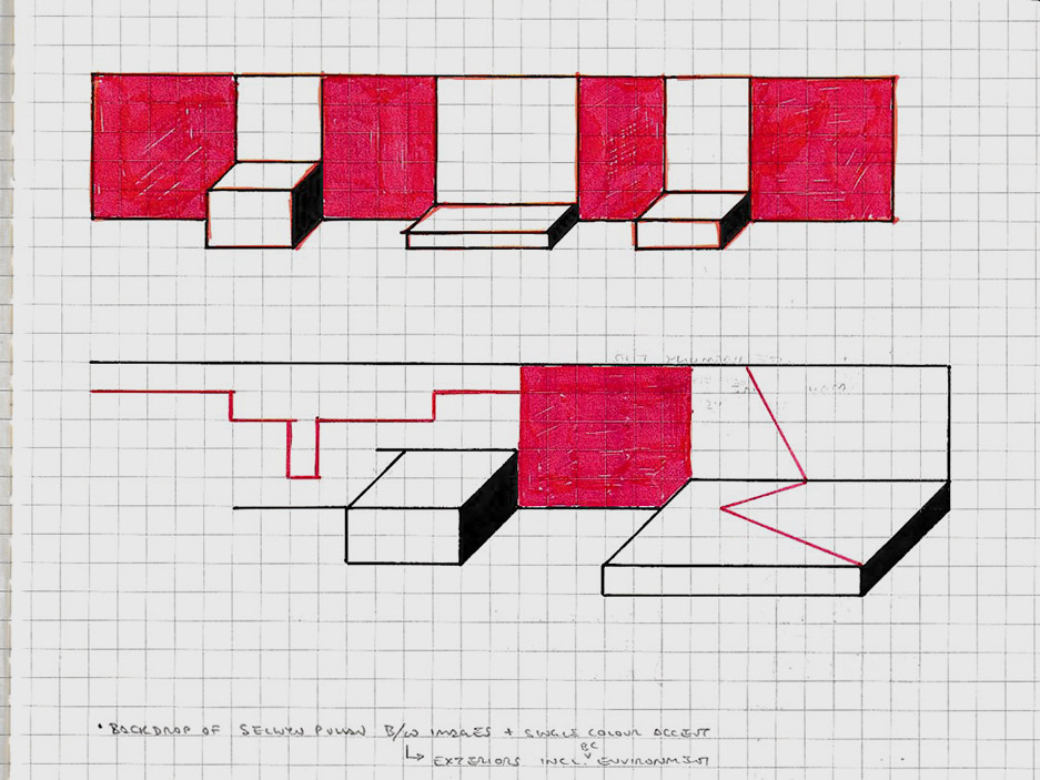
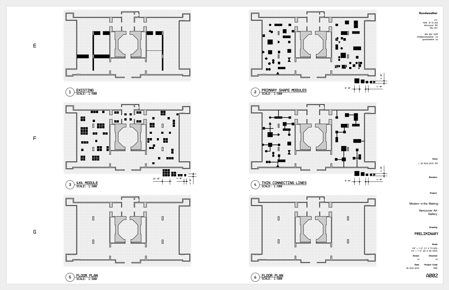
The basic geometric shapes of our fixture modules pushed us to look for something more dynamic in our spacial layout. Our initial grid served its purpose to layout rectilinear shapes in a more measured way, however, by overlaying the existing grid with another, off-axis at 45 degrees, offered a much richer range of possibilities and paired well with our introduction of the triangular module.
Further, we could use this axial offset to challenge the classical symmetry of the exhibition space. We aligned half the exhibition on axis and the other half off axis, perhaps a subtle distinction when navigating the exhibition, but one that attempts to break the uniformity, even if not consciously registered by visitors. This effect would be further developed in the show's title wall, which took a less conventional, sculptural form offering a projecting accordion-fold, or zig-zag, surface.
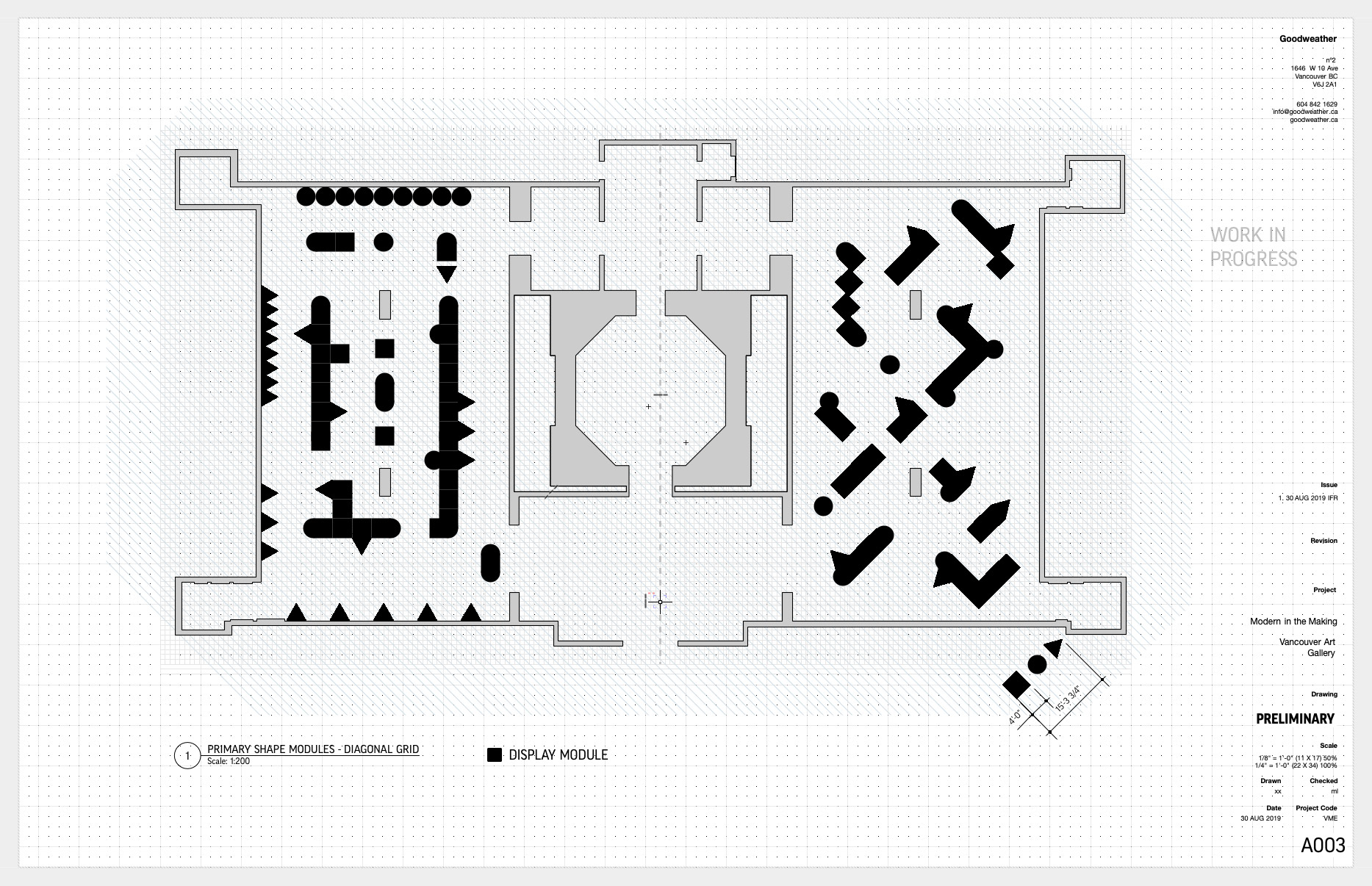
Floor plan displaying fixture layout on- and off-axis with a range of display module cofigurations. (Source: Goodweather Studio)
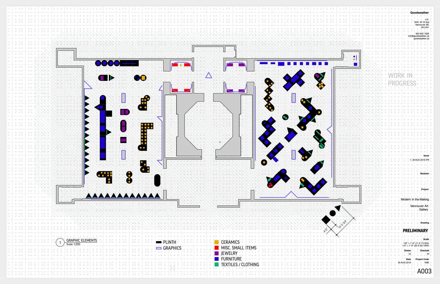
Example of an enhanced floor plan including exhibition items and graphics. (Source: Goodweather Studio)
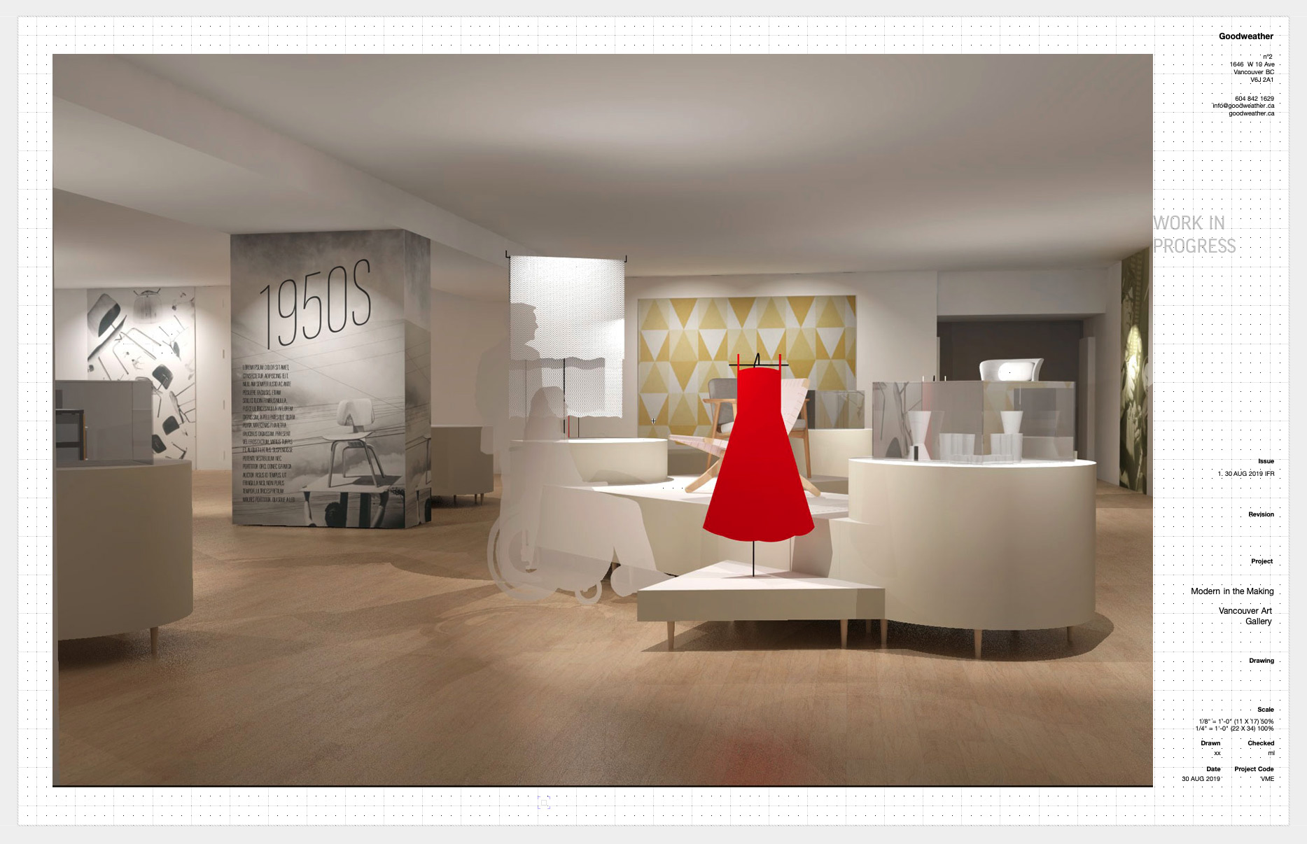
Three-dimensional rendering of the exhibition space. (Source: Goodweather Studio)
Conclusion
Our design attempted to strike a balance between a neutral, uniform, 'museum-like' presentation and something more dynamic and interactive. We eschewed the idea of vignettes and decided to open up the space as much as possible. This would allow better examination (and appreciation) of display objects' production techniques, materials, and design. It would allow visitors to chart their own path through the space, perhaps, a little like navigating through a domestic space. We wanted to afford visitors this intimacy so they could walk away with a first-hand experience of the rich craft and design that emerged during a unique period in BC's history.
Modern in the Making: Post-War Craft and Design in British Columbia is currently on display at the Vancouver Art Gallery through to January 3, 2021.
Copyright © 2020 Oliver Tomas. All rights reserved.