USER EXPERIENCE DESIGN
Navigation Redesign: VSSL Gear: V
Information architecture and UX design for a navigation and footer update to the VSSL gear website.
2019.03.13

VSSL multi-function toolkits are designed to house all your survival essentials in one sleek, lightweight and easy to carry package. (Photo: VSSL)
PROJECT DETAILS
CLIENT
VSSL Gear (via The Jibe)
ROLE
UX designer & information architect
TEAM
Oliver Tomas, The Jibe
RESPONSIBILITIES
Information architecture and wireframes (global navigation and footer)
Overview
I was hired by The Jibe to assist in a navigation redesign for the VSSL Gear website. My responsibilities included improving site architecture (content organization and labeling) and developing wireframes for design enhancements to the nav menu and footer.
VSSL (pron. 'vessel') originated as a Kickstarter-backed company producing lightweight, multi-functional toolkits smartly packed in 8-inch aluminum tubes. The original product was geared toward outdoor survival, but has since moved into other, more recreational, product categories as well as customization.
Project Goals
- Improve site organization to improve findability and better accomodate existing (and future) products.
- Redesign navigation and footer layout to enhance visual heirarchy and overall appearance.
- Better align site architecture and navigation design with brand.
Information Architecture
For VSSL, brand growth has meant refining and expanding its product offering. This has led to the introduction of new product categories, the streamlining of existing ones and archiving (or elimination) of old ones.
The site structure needed updating. These changes would be most visible in the global navigation and footer. We needed an organizational structure that was flexible and clear. It should accommodate the site's content (both current and future) as well as quickly and easily support customers browsing and purchasing products. The underlying structure like the design should reflect the pared-down, utility ethos of the brand.
I started by examining what site visitors were trying to accomplish, their goals. This list included, among other things, learning about products and/or the brand, browsing and comparing items, making purchases, getting support, and connecting with the company or its ambassadors.
Next, I made a content inventory and reviewed existing categorization schemes including any filters, facets and product variants. I considered different approaches to organizing the content (task-oriented and audience-specific browsing versus known-item searching and browsing). I also began considering and collecting words to utilize for category and navigation labels.
In order to manage and organize the information, I sketched out concept maps, brainstormed categories and labels, ran a card-sorting exercise, and compared the organization schemes of related-category brands. When it came to labeling, relying on conventional or familiar terminology would help users understand what options were available and quickly find what they were looking for.
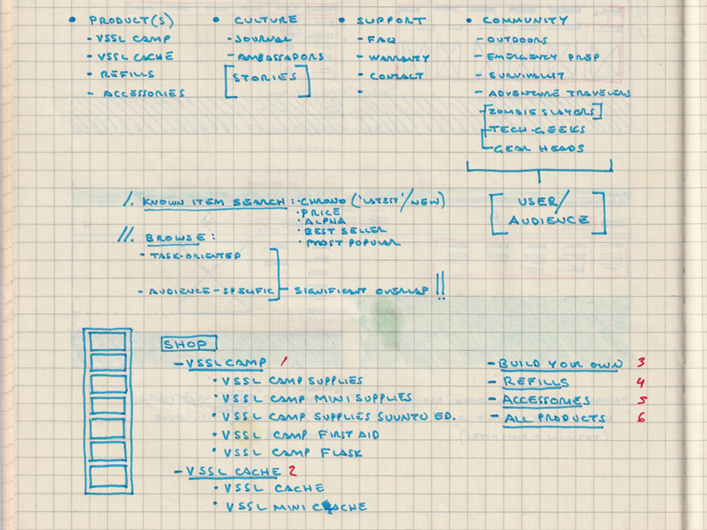
Early notes on categorization and labeling.
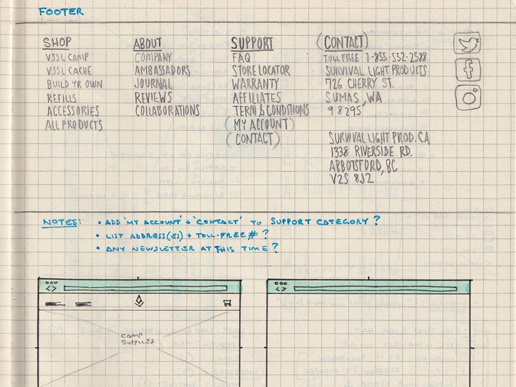
Rough sketch of footer showing content categorization and grouping.
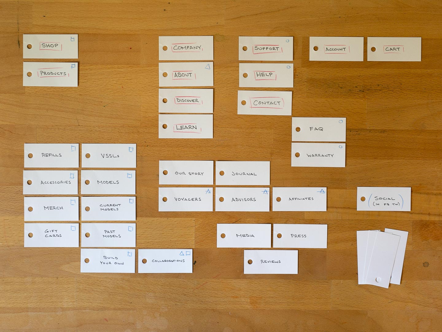
Card sorting exercise to delineate categories and labeling options.
Seeking organizational solutions: a selection of sketches, notes and exercises from the early information architecture phase.
Sketches & Wireframes
With sign-off on the information architecture, I could begin exploring navigation design options. We wanted to work with VSSL's existing design, a dropdown mega menu. I started by sketching. Thumbnail sketches allow a rapid progression of ideas. At this stage the more the better. These sketches explored hierarchy (two- or three-levels), list layout (horizontal, vertical, or both), and the incorporation of visual elements. I gradually increased the scale and fidelity of my sketches and shared them for feedback.
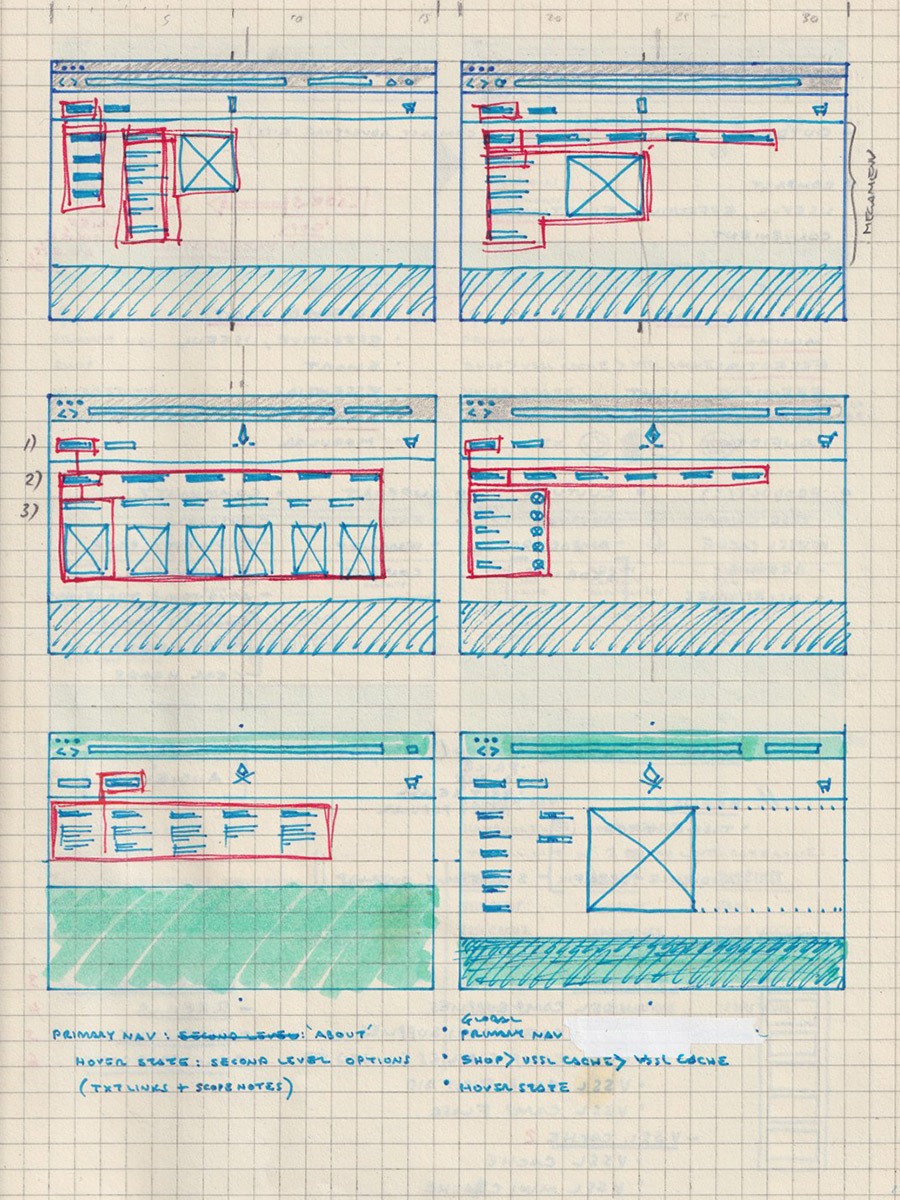
Early sketches testing two- and three-level hierarchies and vertical and horizontal list layouts.
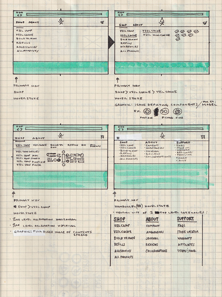
More developed thumbnails incorporating text and graphics.
Further explorations now with graphical icon concept.
Sample thumbnail sketches examining dropdown menu layout, hierarchy and possible visual elements.
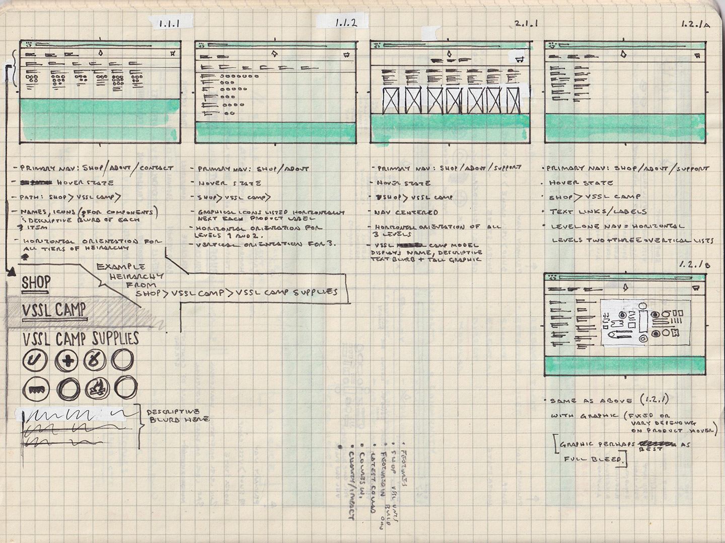
I then migrated a selection of the rough, hand-drawn layouts to digital wireframes. This allowed us to better compare aspects of hierarchy, labeling and visual layout.
Example of horizontal layout with three-level hierarchy and large visual elements (photos).
Mixed horizontal and vertical layout with small iconic graphics.
Hybrid horizontal and vertical layout with three-level hierarchy and groupings supported by icons.
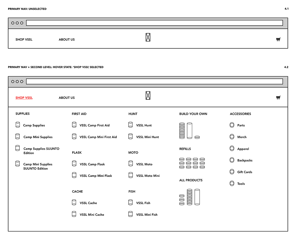
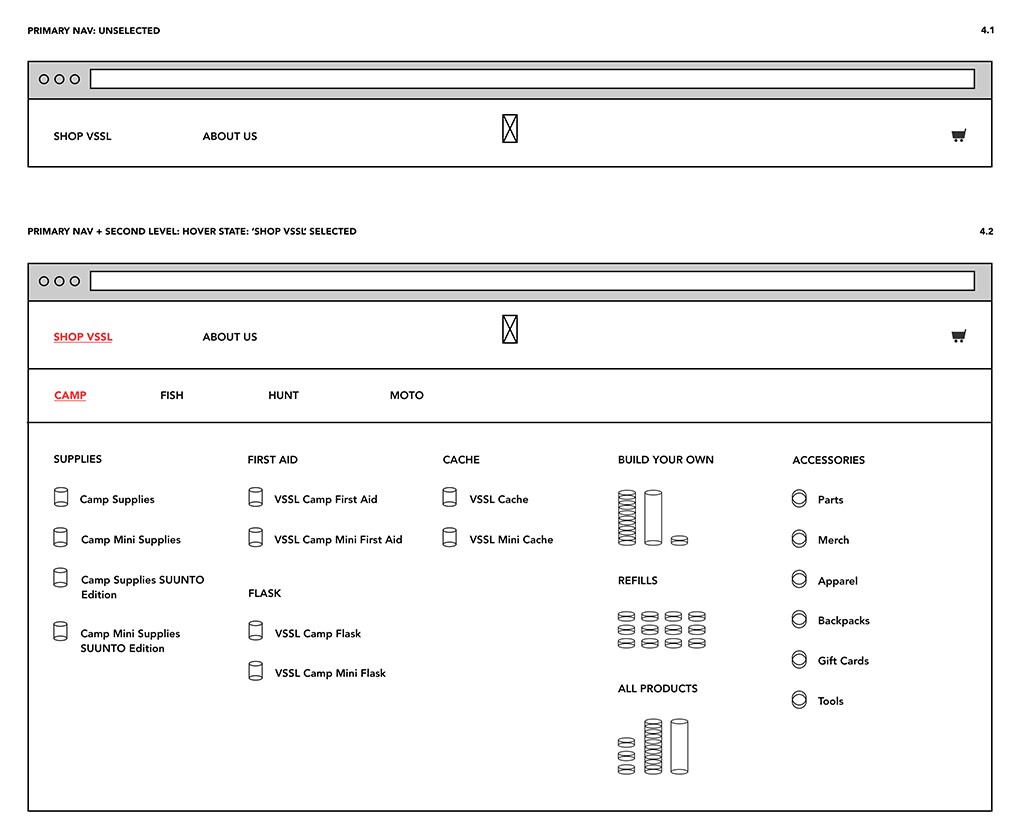
The approved two-level hierarchy and with category groupings and graphical icons.
Exploring and comparing hierarchy, layout and graphical options with low-fidelity wireframes.
A less deep, two-level hierarchy meant fewer clicks and simplified things. Users could get a clear overview of all products in one shot. The real estate available in a large dropdown afforded us this option as well as the inclusion of icons to serve as strong visual identifiers.
These wireframes were then passed on to the designer and development team for finalization and implementation.
Before & After
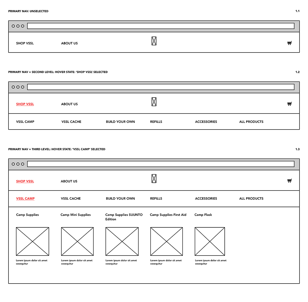
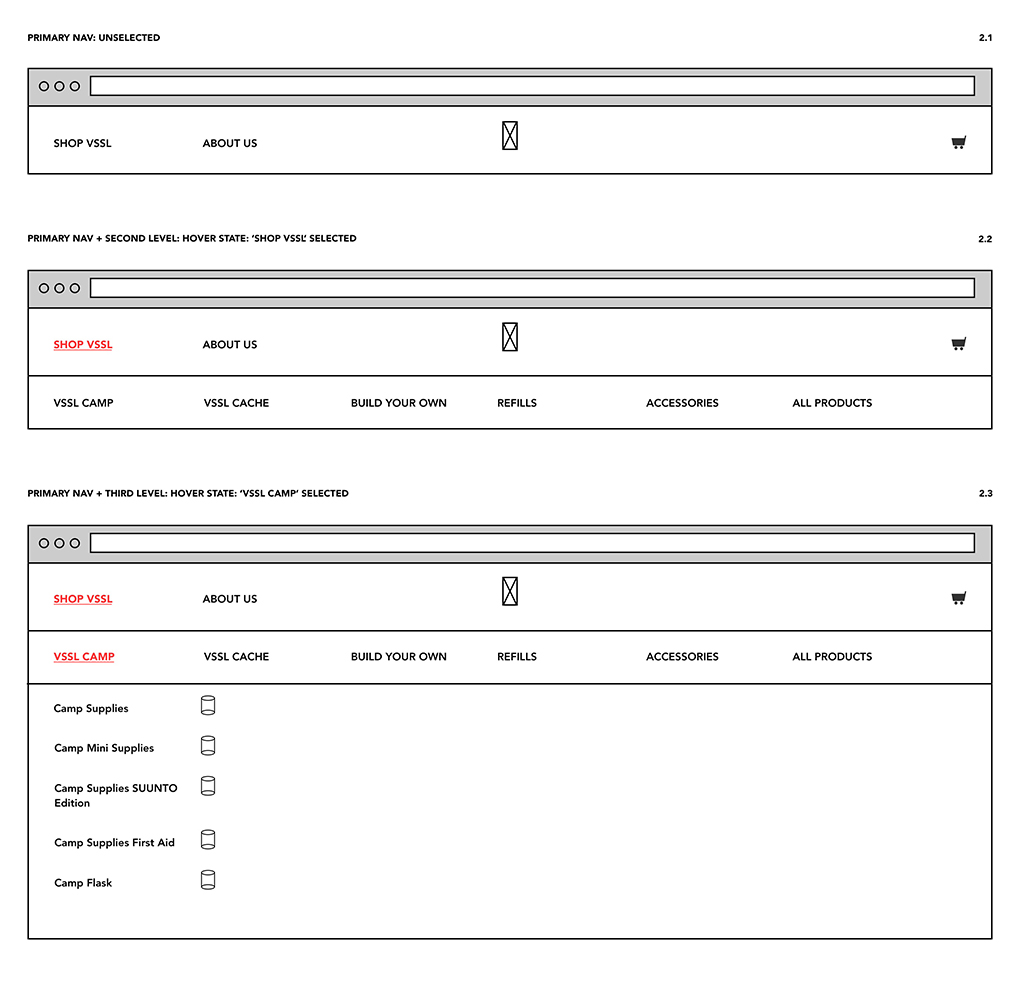
1. Navigation Top-Level

BEFORE – Original navigation menu.

AFTER – Redesigned navigation menu.
2. Dropdown Menu
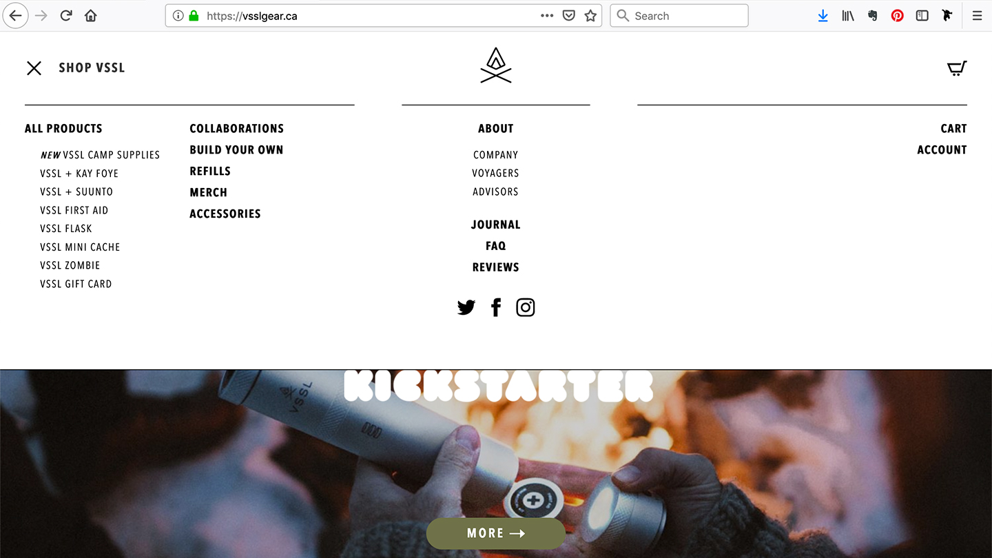
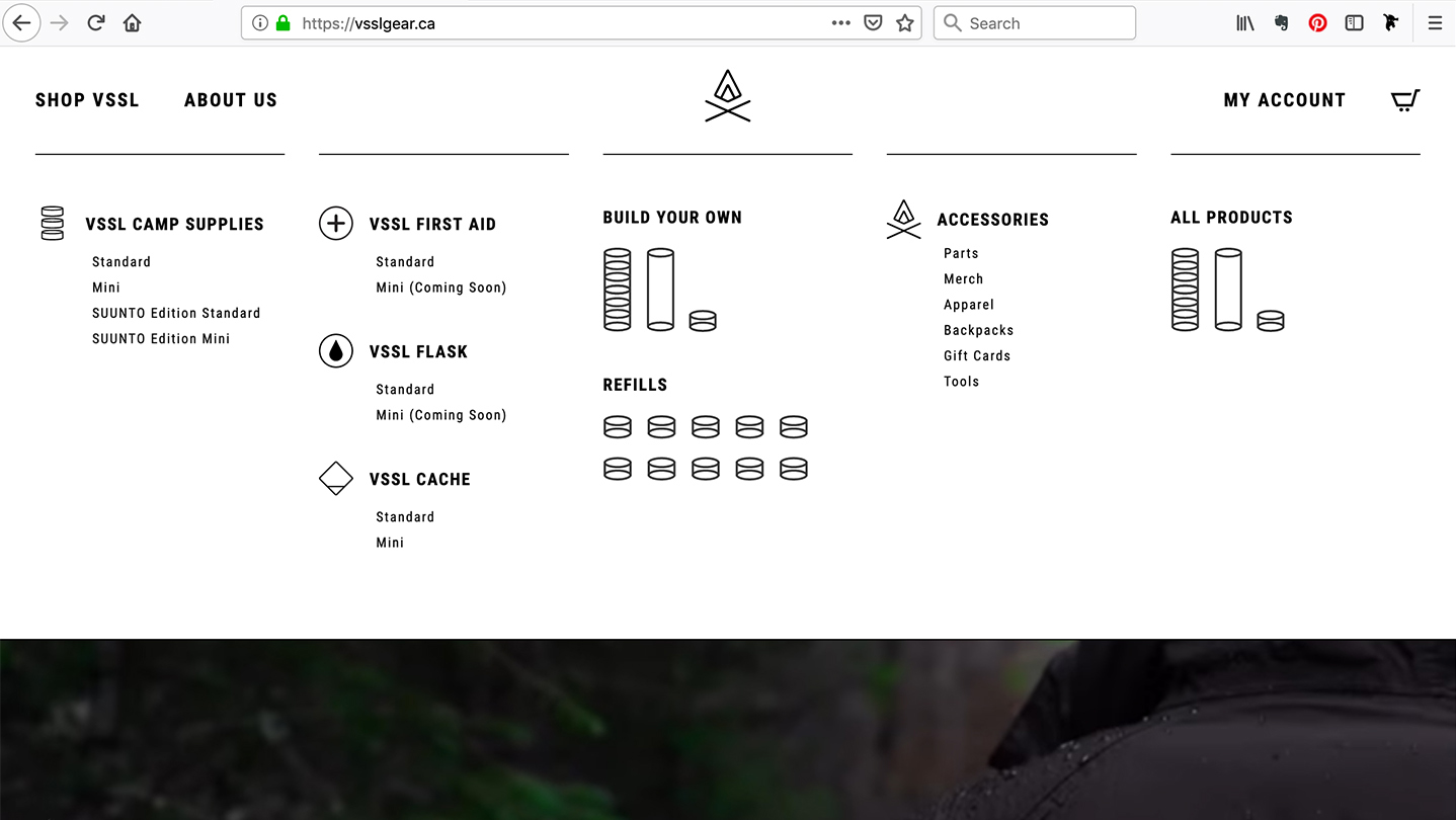
BEFORE (Move slider right →) :: AFTER (Move slider left ←)
Conclusion
The redesign was an opportunity to see just how far VSSL had come and anticipate where it was going. The site structure and organization needed to be revised in order to accommodate a growing, and diverse, product range and to improve overall consistency. The simple and elegant solution was to retain the existing mega menu structure, but enhance the shop offering with a focused product listing, better organization and visual hierarchy, and create a much more compelling, on-brand appearance.
Copyright © 2020 Oliver Tomas. All rights reserved.